Two Nifty Swift Loop Tricks

This week, I learnt two things about Swift that I’d never come across before. Both involve loops.

The first, via Erica Sadun: you can use case let in a for loop to conditionally bind optionals or cast items. Here’s the optional binding example from Erica’s post:

let items: [String?] = [nil, nil, "Hello", nil, "World"]
for case let item? in items {
    print(item)
}

Check out the full post, 3 simple for-in iteration tricks for some other neat tricks.

Secondly, from this post at KrakenDev: you can label loops in Swift! Here’s an example:

sectionLoop: for section in sections {
    rowLoop: for row in rows {
        if row.isMagical {
            break sectionLoop
        }
    }
}

Who knew?! There are a bunch more useful tips in the full post, Hipster Swift, including descriptions of what @noescape and @autoclosure actually do.

New Year, New Job, New Blog

wpcom-wmark

Okay, so we’re already a month into 2016, but I’ve been a bit busy. 🙂

At the end of November, I left my job of 3+ years as a senior iOS developer at Mubaloo to join Automattic as a Mobile Wrangler.

In case you haven’t heard of them, Automattic is most well known for WordPress.com. They’re also responsible for Simplenote, a simple note storage service which I’ve used since the early days of the iOS App Store.

As a Mobile Wrangler1, I’ll be primarily working on the WordPress iOS app (which, as with a lot of Automattic’s products, is open source).

Automattic is an incredible company to be part of. Their mission is to democratise publishing, providing a platform for anybody to have a blog or website. The entire company is distributed across the world, with employees in 43 countries. Pretty much everybody works from their own homes (although if you want to work from a coffee shop or a coworking space, that’s cool too) and sets their own schedules. With a 1 year old son at home, I’m so grateful that I’m now at home all day; I get to see him so much more than I used to, we can all have lunch together, and I can work a schedule that suits my family.

I’ve also converted this site (which hasn’t received much love recently) over to WordPress, and I hope to begin writing here again soon.


  1.  At Automattic, you actually choose your own job title. Mobile Wrangler is what most of the mobile developers go by, although there’s definitely a Pokémon Trainer amongst the ranks too. ↩

Fixing Xcode’s Invisible Cursor

When writing code, I generally like to use a dark theme in my IDE or text editor. For Xcode, I really like the Tomorrow Night and Seti themes in particular (both of which can be easily installed using the Alcatraz package manager).

In Xcode, however, there’s a slight problem for dark theme fans:

xcode_beam.png

By default the ‘i-beam’ mouse cursor in the editor is really hard to see, particularly on a high resolution monitor. I’d often find myself losing it and having to shake the mouse to activate El Capitan’s mouse zoom feature.

But there’s a solution! I noticed that Terminal.app’s i-beam cursor has a stronger shadow, which makes it easier to see on dark backgrounds. The cursors are just .tiff image files, so it’s trivial to steal Terminal’s cursor and stick it into Xcode.

If you want to do it manually, you’ll need to copy /Applications/Utilities/Terminal.app/Contents/Resources/ShadowedIBeam.tiff over the top of /Applications/Xcode.app/Contents/SharedFrameworks/DVTKit.framework/Versions/A/Resources/DVTIbeamCursor.tiff. Or you can just run this snippet in Terminal, which will do it for you:

cd /Applications/Xcode.app/Contents/SharedFrameworks/DVTKit.framework/Versions/A/Resources; sudo mv DVTIbeamCursor.tiff DVTIbeamCursor.old; sudo cp /Applications/Utilities/Terminal.app/Contents/Resources/ShadowedIBeam.tiff DVTIbeamCursor.tiff

The change in shadow is actually only slight, but I find it makes a big difference in helping me locate the cursor:

terminal_beam.png

And here’s a before and after:

before_and_after_beams.png

Update: On Twitter, @TwoLivesLeft pointed out that iTerm’s cursor has even better contrast:

Update 2:Also on Twitter, GregHeo, there’s a super-mega visible cursor available on Github: https://github.com/egold/better-xcode-ibeam-cursor

The Just Checks Today Widget

Inspired by Shawn Blanc’s “The Just Checks” episode of The Weekly Briefly podcast.

The Just Checks are those times throughout the day when we ‘just check’ our phones: skim over our Twitter feeds, browse RSS, check our emails, etc. In Shawn’s words:

… as soon as I’m holding my phone, it’s instinct at this point to swipe-to-unlock the thing. And then, once the phone is unlocked and I’m staring blankly at my Home screen of icons, I’m going to want to launch an app. But because I unlocked the phone without any clear plan for what I needed to do, the next thing I know I’m checking Twitter. And all the while, I don’t even know what time it is. See? It’s a bad habit.

I built this widget to help limit my own bad habits of ‘just checking’ Twitter and RSS many many times throughout the day. Apple doesn’t allow widgets on the App Store that launch other apps, so I’m releasing the code on Github in case anybody else wants to try it out for themselves. The widget is currently set up to work with Tweetbot and Unread, and uses their URL schemes to launch the apps.

The Just Checks Today Widget

The idea is this: the widget displays an icon for Tweetbot and an icon for Unread. When an icon is tapped, the associated app is launched. The widget then keeps track of the amount of time since you launched that app. There’s a timeout set so you can’t relaunch an app through the widget more often than once every hour (because really, why should you need to?). I’ve also hidden my Tweetbot and Unread app icons away in a folder on the last home screen on my phone. This adds enough extra friction that I’m more likely to use the widget to launch my apps.

In the short time I’ve been using the widget, I’ve found that seeing the timer when I go to launch an app has been really effective at getting me to just put my phone back in my pocket. I’ve even caught myself going to check Twitter and realising that I’d only checked it 5 minutes ago, when I could’ve sworn it was much longer. I’ll stop in my tracks, lock my phone, put it back in my pocket, and get on with my day.

Also worth checking out: Shawn Blanc’s Alternatives to The Just Checks.

Code for the widget is available on Github.

Calculating App Store Spend

I like buying apps. Perhaps it comes from being an app developer myself, but I like to pay for apps that I enjoy and that I get value from. Designing and building an app takes a huge amount of work, and I hope that paying for an app means that it’s more likely to receive updates in the future.

I’ve recently had a couple of conversations with people who have never paid for an app, which made me curious about just how much I’ve spent over the years. Unfortunately Apple provides no easy way to see this information. but they do send out regular receipt emails when you make a purchase. I’ve always archived these emails in my Gmail account, so I put together a small script to parse them and produce some figures. I mentioned it on Twitter and a number of people showed interest in it, so I thought I’d reproduce it here.

The steps below outline how I retrieved my own emails and ran the numbers; of course, everybody’s setup is different but hopefully you’ll be able to adapt them to your needs. I use Gmail as my email provider and OS X as my operating system, so all of the instructions are specific to that setup.

  1. First of all, you’ll need to tag all of your iTunes receipts with a unique tag. I have a filter set up for the following search, which tags all matching emails with iTunesReceipts:

    from:(itunes store) subject:(your receipt no.*)

  2. Next, download all of your iTunes receipts as .eml files. I used Gmvault to download mine. Grab the tool and extract it. I used the following command to fetch the relevant emails:

    gmvault sync --type custom --gmail-req "in:iTunesReceipts" your_email_address@gmail.com --no-compression

    By default, Gmvault will download the emails into a directory named gmvault-db/db in your home directory.

  3. Nowcd into the Gmvault db directory. You can then either manually download my parser script from the [Github Gist] and run it, or download and run automatically in a single command:

ruby -e "$(curl -fsSL https://gist.githubusercontent.com/frosty/b6d1615dab5544fc22b0/raw/e4e3b48b032079e188c8d3f246b2609b83995558/parser.rb)"
  1. The script will first ask for the currency symbol your emails will use; it defaults to ‘£’ if you just press enter. It should then output a count and combined spend for iOS apps and in-app purchases. It’ll also create a tab-separated file named Apps.tsv, which will contain a list of all of your purchases. You can open this in a text editor or a spreadsheet app like Numbers if you want to.

Notes

  • The script could probably be much neater, but I don’t work with Ruby very often and I just threw it together in an evening!
  • I make no guarantees that this script catches everything or that it doesn’t pick up any false positives. The iTunes receipt format is quite awkward and inconsistent and has changed quite a lot throughout the years. Based on my own receipts, however, this seems to do a pretty good job.
  • If you have a suggestion for ways to improve the script, feel free to fork it on Github!

So how much have I spent on apps? Turns out, it’s rather a lot. But when I average my spend out over the life of the App Store, and consider the amount of value and enjoyment I get from the various apps and games I’ve bought over the years… I think it’s a pretty good deal.

Multitouch with Haxe NME

I’ve been getting really interested in Haxe NME recently. Haxe is an open source cross-platform language, and NME adds a display framework on top of that which is modelled very closely on Adobe’s Flash API. The beauty of it is that you can write one codebase and then compile it to native code for Flash, HTML5, Windows, Mac, Linux, iOS, Android and more.

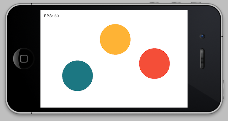
Haxe NME screenshot

I was trying to get to grips last night with handling multitouch input using NME, and I struggled to find a decent example. I managed to get something working and so I put together an example myself which I’m sharing here. It’s a simple example which tracks each distinct touch point and displays a randomly coloured circle beneath that touch. I’ve tested it on iOS and Android.

Grab the source from Github

Windows Phone 7: Twitter Apps

The Lowdown

I recently picked up a Nokia Lumia 800 phone, running Windows Phone 7. In short: I’m a geek, I like trying out new tech, I’ve had an iPhone since mid-2008, and I really liked the look of what Microsoft has done with Windows Phone 7. I’m working on a full review, but as I’m getting to grips with the phone and the OS I figured I’d write up some of the issues I run up against.

Today: finding a Twitter app.

Continue reading “Windows Phone 7: Twitter Apps”

Ascension: Chronicle of the Godslayer

Ascension: Chronicle of the Godslayer is a card game that has some similarities to the popular Magic: The Gathering collectable card game. My first introduction to Ascension was through its well-received iOS version, which I liked so much that I went straight out and bought a copy of the physical game too1. This is primarily a review of the iOS version, but both versions play exactly the same and are equally enjoyable.

Ascension is a deckbuilding game designed by a former Magic Pro Tour champion. I’ve played a small amount of Magic in the past but was put off by the amount of pre-game preparation that is necessary and the sheer number of cards that are available (although I realise that it’s exactly these elements that draw many people to the game).2 I think Ascension struck a chord with me because it’s reminiscent of Magic but (in my opinion) improves upon it in a number of ways.

Continue reading “Ascension: Chronicle of the Godslayer”

Codify

I love the iPad. It’s casual, immediate, and more intimate than a laptop ever will be. There are wonderful apps available for most activities you could want to do on an iPad: reading, writing, drawing, listening, watching, playing; the list goes on. Much of the time when I want to perform some task (or just relax), I will now reach for my iPad instead of my laptop if possible. However, until now I have been unable to use the iPad for one of my favourite pasttimes: programming1.

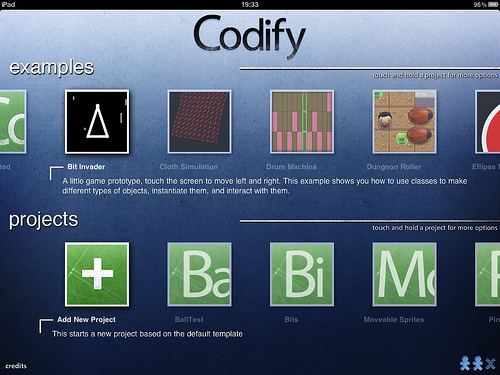
Enter Codify. Codify is a new iPad app that lets you create simple games, prototypes and simulations directly on an iPad. You write code in the Lua language using a fantastic code editor (more on that later), with an API that’s very similar to Processing. You can then run that code straight away; play your game, experiment with your prototype, tweak your simulation. It’s fast, easy, impressive, and fun.

Codify project selection screen

Continue reading “Codify”