- I got a lot of value from Cal Newport’s last book, Deep Work, so I’m looking forward to his new one, out at the beginning of February: Digital Minimalism. Cal was recently on the podcast Hurry Slowly, discussing Using Technology with Intention.
- How to Develop Better Habits in 2019: Some good practical tips from Ryan Holiday for building habits this year.
- A Weekly Review For Your Goals: Review your goals weekly to see your progress and push your plans forward.
- How to Exhibit Leadership as an Individual Contributor: “Leadership is not tied to a position. Leadership is a mindset.”
- I just started using Ulysses this week to organise my writing and notes, and it’s fantastic. A simple hierarchical folder structure (with custom icons!) is a game changer. I found Shawn Blanc’s guide to his Ulysses setup had some really helpful ideas for how to use it.
- The developers behind Codea, the awesome coding app for iPad, recently blogged about the little details behind their app’s dropdown menu interface. It’s a fantastic piece of UI, and so much thought went into it. Part 1, Part 2.
- Sean McCabe posted this fun little video on Twitter as a reminder not to overthink things, and just get your story out there: Stop Overthinking. Start Doing.
Week Links – 2018/12/23
It’s nearly Christmas and I’m spending time with family, so just a few links this week!
- Shawn Blanc’s Plan Your Year workbook has been updated for 2019. I’m really excited to sit down with my wife and plan our upcoming year. We did it for the first time for 2018, and it really helped us put more thought into how we were going to spend our year instead of ambling from one thing to the next.
- Jocelyn K. Glei’s upcoming RESET course sounds interesting!
- Six Years With a Distraction-Free iPhone – After removing Twitter from my phone, I noticed I’d often replace that habit with checking email or Slack instead. After reading this post I’ve removed those apps from my phone too.
- How a Password Changed my Life – I remember reading this a couple of years ago but it came up again this week. Neat idea!
Week Links – 2018/12/15
I’ve decided to start collating a short post each Sunday of interesting things I’ve found online over the past week. It could be anything; this week there’s productivity posts, books, some podcasts, and even a recipe. It’s an experiment.
I’ve decided to start collating a short post each Sunday of interesting things I’ve found online over the past week. It could be anything; this week there’s productivity posts, books, some podcasts, and even a recipe. It’s an experiment.
Podcasts
- The Seanwes Podcast. Creativity and business topics, released weekly. I listened to a handful of episodes so far which I really enjoyed:
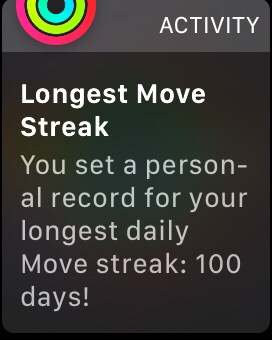
- 381: Why and How to Start an Exercise Habit. I had a pretty great exercise habit going last year, but I let it slide in 2018 while we were expecting our second child. I finally broke my 465 day move streak on my Apple Watch, and since then exercise just hasn’t been a focus for me. And I’ve noticed it! This episode has helped to give me a kick to start to work on this again. Ask yourself each day: what have I done to exercise my body today?
- 375: 3-Month Guide to Waking up at 6am Consistently. My morning routine isn’t entirely under my own control, as I have both a 3 year old and a 3 month old kid. But I love the idea of a relaxed morning routine with time intentionally set aside to start the day right and think or stretch or exercise or write.
While I can’t completely control when I’ll need to be awake on a given morning right now, I can control my evening routine. Listening to this episode made me realise I need to make sleep more of a priority, and I’ve already incorporated some of the ideas into ‘shutting down’ slowly in the evening and getting to sleep at a decent time.
The other big takeaway for me was thinking about a proactive vs a reactive morning. If I’m woken up by my son yelling that he wants to get up, I’m starting the day in a reactive state. The same goes if you’re checking your email or Twitter as soon as you wake up – you beginning by reacting to what the world is throwing at you. Instead, think about being more proactive and setting your own agenda for the morning.
- Hurry Slowly, “a podcast about being productive, creative, and resilient, through the simple act of slowing down”. I’ve only listened to 003: Craig Mod – I Want My Attention Back! so far, but it definitely made me think about what an attention suck my smartphone is.
Productivity
- Start your days right with a consistent shutdown routine – The Sweet Setup. Cal Newport discusses a similar idea in his book Deep Work.
- Seventh Week Sabbaticals. More from Sean McCabe, this time the idea of taking a sabbatical week every 7 weeks to prevent burnout and create margin.
- Taking a Depth Year by Leo Babauta at Zen Habits. I don’t think I’d go so far as doing this for a whole year, but I like the idea of finding more depth and value in the things you already own and the activities or hobbies you’ve already started. Improving existing skills, watching media you already have, reading that stack of books you haven’t got to yet or rereading your favourites.
- Also from Zen Habits: Simplify Technology with Limits. I really liked the limit of “No phone use in the car, at the dining table, while in line, or while talking with other people”.
- Finally, a tweet (or rather, a short thread): https://twitter.com/clairejlew/status/1072910212573495296. In 1:1 meetings, ask specific questions and suggest ways you can help instead of just asking an open-ended “how can I help you?”.
Books
- I just finished Atomic Habits, by James Clear. It’s a really concise, practical guide to creating good habits and breaking bad ones.
- Also, inspired by the morning routine episode of the Seanwes Podcast mentioned above, I’m currently reading My Morning Routine.
- I came across a great top 100 list of books from 2018. I downloaded a bunch of samples to my Kindle while going through this list.
- An older post, but Shawn Blanc has an interesting idea of creating an alternative index for a nonfiction book while you’re reading it. Normally I wouldn’t even consider defacing a book, but I can see this would be a really useful approach with nonfiction books. I current try to mostly read Kindle books, as I want to minimise the amount of physical ‘stuff’ that I own, but flicking through a physical book is definitely much easier and you get a better spacial awareness of your notes and highlights. I’m still not sure what the best balance for me is here. See also: Ryan Holiday’s notecard system.
Misc
- Matt Gemmell posted about mechanical keyboards. I’m now lusting after a WASD keyboard, and started following them on Instagram.
- We’ve been prepping Wholefully’s overnight oats for a while now as quick grab-and-go breakfasts, but I just discovered their instant oatmeal recipes. Easier to make than porridge, easier to clean up, and you can prep the pots days before. Just add water.
iPad Pro (2018) First Impressions
Some initial thoughts after trying out the new 2018 11” iPad Pro for a couple of days.
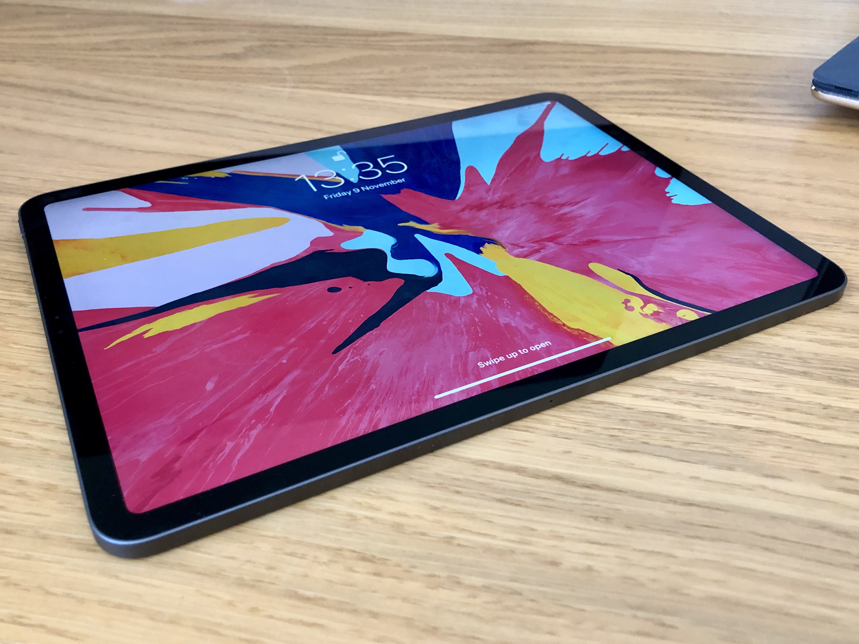
I picked up a new 11″ iPad Pro this week, to replace my original 9.7″ Pro. I’ve been using it for a couple of days now, so here are some of my initial thoughts in no particular order:
- I love the squared edges of the new design. I was surprised to read reviews saying how much thinner and lighter the new iPad feels, as to me it feels marginally thicker (even though it’s actually 0.2mm thinner). It’s also slightly heavier (about 30g). I hope this design is brought to the iPhone next year.

- The screen feels much bigger (and it is!). iOS and its apps have more room to breathe. Although it would’ve been nice if it were a tiny bit wider to keep closer to the original 4:3 aspect ratio.
- This thing is a fingerprint magnet! Seems to show up way more fingerprints than my original Pro.
- I’ve not had a device with ProMotion before, and wow – animations feel super slick. Scrolls like butter.
- I’m still getting used to how to hold the iPad now that it has thinner bezels. In one hand, you end up with your thumb resting on the edge between the front and side of the device, as the bezel isn’t wide enough to place your thumb there without touching the screen.
- The majority of the third party apps I’ve tried so far haven’t been updated for the new screen size, which means black bars at the top and bottom of the screen. In landscape, this makes the new aspect ratio (no longer 4:3 on the 11″) even more obvious, and I’m still getting used to it.
- Face ID works very well, but can be a little awkward in practice due to the camera being situated along just one edge of a device that can be (and is) used in any orientation. Now that the home button is gone, it’s not always immediately obvious where the front camera is when you pick up the iPad – particularly if you’re using it in a dimly lit room. For example, if I’m reading in bed I’ll often hold the iPad in portrait orientation and rest the bottom of it on the bed covers. But half the time it turns out that the iPad is ‘upside down’, so the Face ID cameras get blocked by the bedding. The iPhones X don’t have this issue because the notch helps you know which way is up.
- This is an incredible, futuristic, fast device. It feels fantastic to hold, looks amazing, and is a joy to use. I’d love to use it for all my computing needs. Xcode for iPad, please!
And a few thoughts on the new Smart Keyboard Folio:
- The new Smart Keyboard Folio is much sturdier than the old Smart Keyboard Cover, and is certainly much more stable when typing on your lap. The iPad can also now be positioned in at a shallower viewing angle, which is much nicer than the very steep angle of the old cover.
- I was worried that it’d be difficult to put the iPad into / take the iPad out of the folio, but it’s actually very simple thanks to the magical array of magnets present in the new Pro.
- The magnets are so strong, it’s now more difficult to collapse the iPad when it’s propped up in the folio. I haven’t yet worked out the right places to grab it without either touching on the screen or mashing on the keyboard.
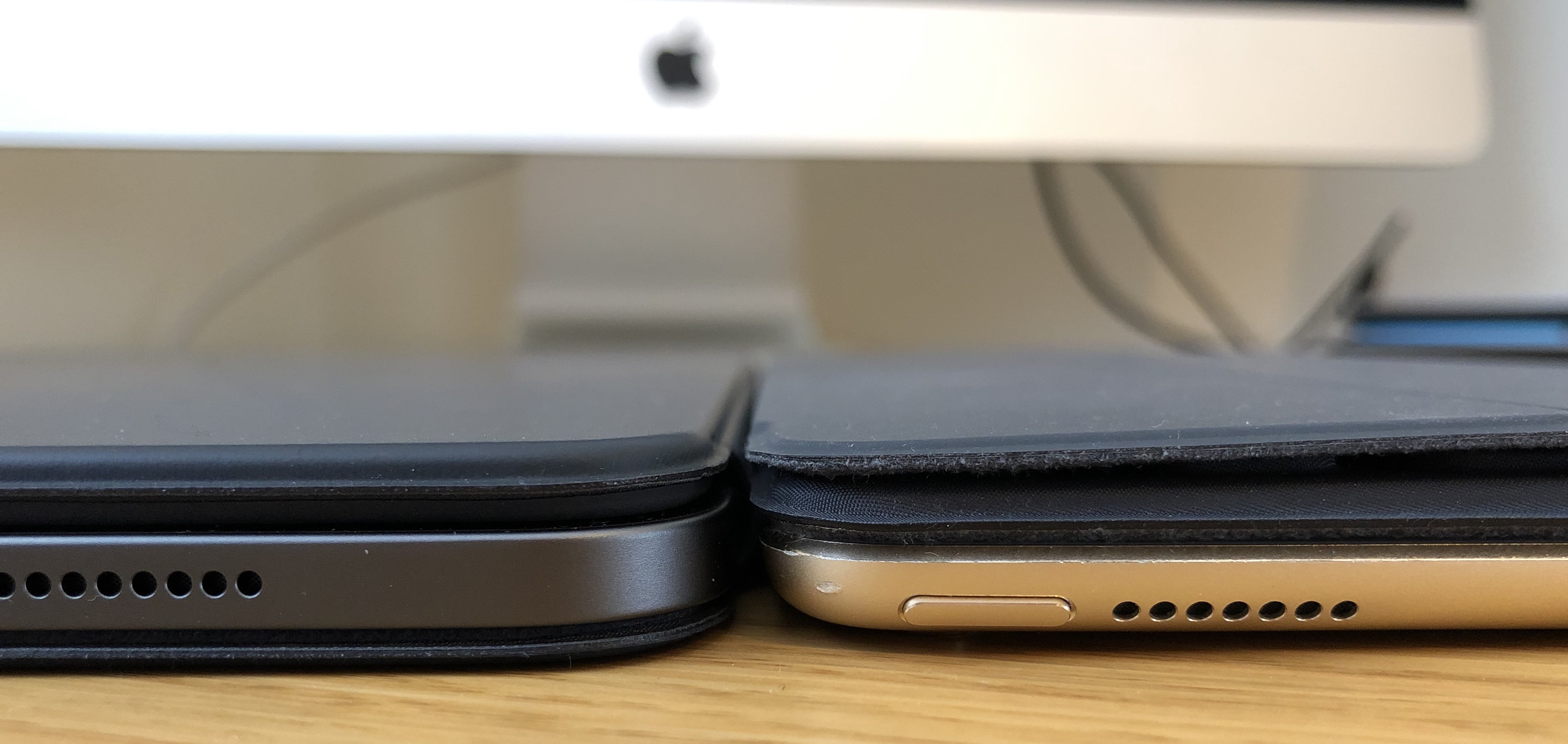
- Because the new folio wraps around the front and back of the iPad it does increase the bulk, and it’s even heavier than the Smart Keyboard, which already added quite a lot of weight to the device. Laid flat, the new Pro in the folio is about the same thickness as the thickest part of the old keyboard cover:

Tweet Less, Do More
My wife and I spent some time last week planning some goals, events, and projects for 2018. Among other things, I’d like to read more, blog more, and be more intentional about how I spend my free time.
A first step to achieving this: on the 1st of January, I deleted Tweetbot from my phone. If I want to check Twitter, I can do so on my iPad, but I’ll only look once a day. The payoff has been great, even after only one week:
- I used to be a timeline completionist (I had to read every tweet), but now I’m letting it go. It’s freeing.
- I’ve found I’m no longer carrying my phone around the house, everywhere I go. Why did I do that before? What was so important?
- It’s not just that I’m carrying it around less though. I’m using it less in general. I feel less attached to it. I don’t feel anxious if I don’t know where it is. The other day I left the house to go and work from a cafe, and accidentally left my phone at home because the need to have it didn’t really occur to me.
- I’ve started charging my phone in a different room at night (not the bedroom), so it’s not the last thing I look at before bed. I also don’t rush to get it first thing in the morning – I’ll generally pick it up before work. Again, it’s one less thing to think about.
- Instead of constantly checking my phone, I’ve started ensuring my Kindle is always to hand. Before bed, I’ll read some of a book. Any downtime I want to fill, I can read some of a book. As a result, I’ve already read two books in the first week of the year, and that’s unheard of for me in recent times.
Hey, and here I am writing a blog post.
Losing It
Since the beginning of May I’ve lost over 10kg, many many inches, and I’m probably the fittest that I’ve ever been.
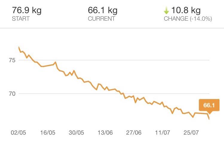
I’ve always been quite skinny, and I could get away with eating pretty much anything I wanted without putting on weight. But a couple of years ago I stopped walking to work, and around the same time my wife and I had a newborn baby which meant I was constantly exhausted and paid less attention to what I was eating. Quick and easy was the order of the day. Before I knew it, without even noticing it was happening, I was heavier than I’d ever been, and I was very unfit. Clothing that I’d worn for years was starting to feel very snug, or not fit at all. I finally decided enough was enough.
At the beginning of May, my wife and I began to make a conscious effort to improve our health, lose weight, and get fit. It’s not actually been too arduous, and it’s been made much easier by the fact that we’ve been doing it together. If one of us doesn’t feel like working out on a given day, we offer encouragement. We can help each other track our eating, and share the job of preparing meals. We can push through the harder times and celebrate our progress together.
Anyway, enough of the preamble. You’re probably wondering what we’re doing to achieve our goals. It’s really a couple of fairly small lifestyle practices that add up to some great results.
Diet
Eat Less
It sounds obvious, but the big change here is that we started watching what we’re eating. Counting calories can be a bit of an effort (particularly as we cook most meals from scratch), but we did it for the first month to get a better understanding of our intake. It’s also a tried-and-tested way to lose weight. If you have the right calorie deficit every day, you should lose weight. Now it’s become second nature to have smaller portions and make better choices.
MyFitnessPal has been excellent for tracking calories, and I’d highly recommend it. I used it initially to calculate a daily calorie intake based on my weight, height, activity level, and the rate at which I wanted to lose weight. I aim for around 1500 calories a day. It’s got a huge database of foods, and it’s easy to add anything that’s not already in there. You can even scan barcodes for ease of entry.
Less Carbs
We eat very few refined carbohydrates, which really helps when trying to hit a daily calorie goal. No bread. We don’t really eat any rice, pasta, or potatoes. We make the other parts of our meals a little larger to compensate. For example, just make a bit more curry instead of having rice as well. Very occasionally, we’ll have a small spoon of one of the above with a meal, but often we’ll just replace it with some more veg like broccoli.
My wife and I have never really drunk alcohol much (I could count on one or two hands the number of times we have it in a year) and we never have sugary soft drinks, so that helps – just tea, coffee, and water. If you do drink either, cutting them out most of the time can be a great way to ditch a tonne of empty calories.
Think
Essentially, improving your diet boils down to making better choices. At each meal, particularly if you’re dining out, think about what small tweaks you could make to cut out some calories or make things healthier.
Swap those chips for a healthier side. Have an extra sausage and some more vegetables, but ditch the mash. Have a takeaway, but just don’t have rice with your curry (or share with someone else). I’ll often weigh up the rough calorie cost in my head: “do I really want to ‘spend’ an extra 200 calories on this?”
We still have treats, we just don’t go crazy. To borrow a phrase from Matt Gemmell, we just don’t routinely overindulge.
A lot of people say losing weight is 80% down to diet, and I think that’s pretty accurate. Watching my diet is the main way I’ve lost weight. Exercise is for toning, building a bit of muscle, and generally improving my fitness level.
Exercise
Three pieces of technology have been indispensable to my efforts to get fit: Apple Watch, a website, and a bike.
Apple Watch
The Apple Watch features three daily activity goals: “Stand”, which requires you to stand for 1 minute each hour for 12 hours of the day; “Exercise”, which requires you to do 30 minutes of activity a day; and “Move”, which requires you to hit a user-defined goal for calories burnt each day.
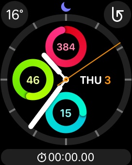
When I first got my Watch, I paid attention to these activity rings. I had a 78 day Move streak going (hitting the goal every day). But then I accidentally broke the streak, and I’ve rarely looked at the activity goals since. It seemed such an effort to get back to 78 days.
From the 1st of May, I decided to make a conscious effort to hit every ring every single day. It’s a way for me to force myself to get active each day. Today marks the 100th day of my new streak, and I really don’t want to break it now. I set my calorie goal low to begin with to set myself up for success, and I’ve been increasing it every week.
Nerd Fitness
I’m alternating between two things to hit my activity goals each day. The first is regular body weight strength workouts. We use an online workout plan from the Nerd Fitness Academy. Nerd Fitness provides a simple, structured workout plan which you can do at home with either no or minimal equipment. We’ve worked our way up from ‘bodyweight level 1’, and we’re now at level 3.
Each level offers two or three different workouts which you can alternate between. We aim for 3 workouts a week. Each workout consists of a warmup, 3 or 4 exercises which you normally do in sequence and repeat 3 times, and then a cool down. The whole thing usually takes us no more than 15 or 20 minutes, and we’re both much stronger than we were when we started. It’s been great to see just how much we’ve progressed over the last couple of months.
The exercises are generally very straightforward; things such as push ups, inchworms, one-arm rows, squats, and lunges. Each exercise also has a really short, simple, well made video showing how to do it correctly.
Some days it’s a struggle to start a workout, but one of us can usually motivate the other to get going. It really doesn’t take very long, and we always feel good about it once we’ve actually done it. Our 2 year old son also enjoys joining in and doing his exercises with us.
Exercise bike
My secret weapon in my goal to hit my activity rings every day is my exercise bike. Back at the start of this adventure, with some fantastic advice from Matt Gemmell (you might see a pattern here), I picked up a relatively cheap stationary indoor bike. I primarily use it on the days I’m not doing a strength workout.
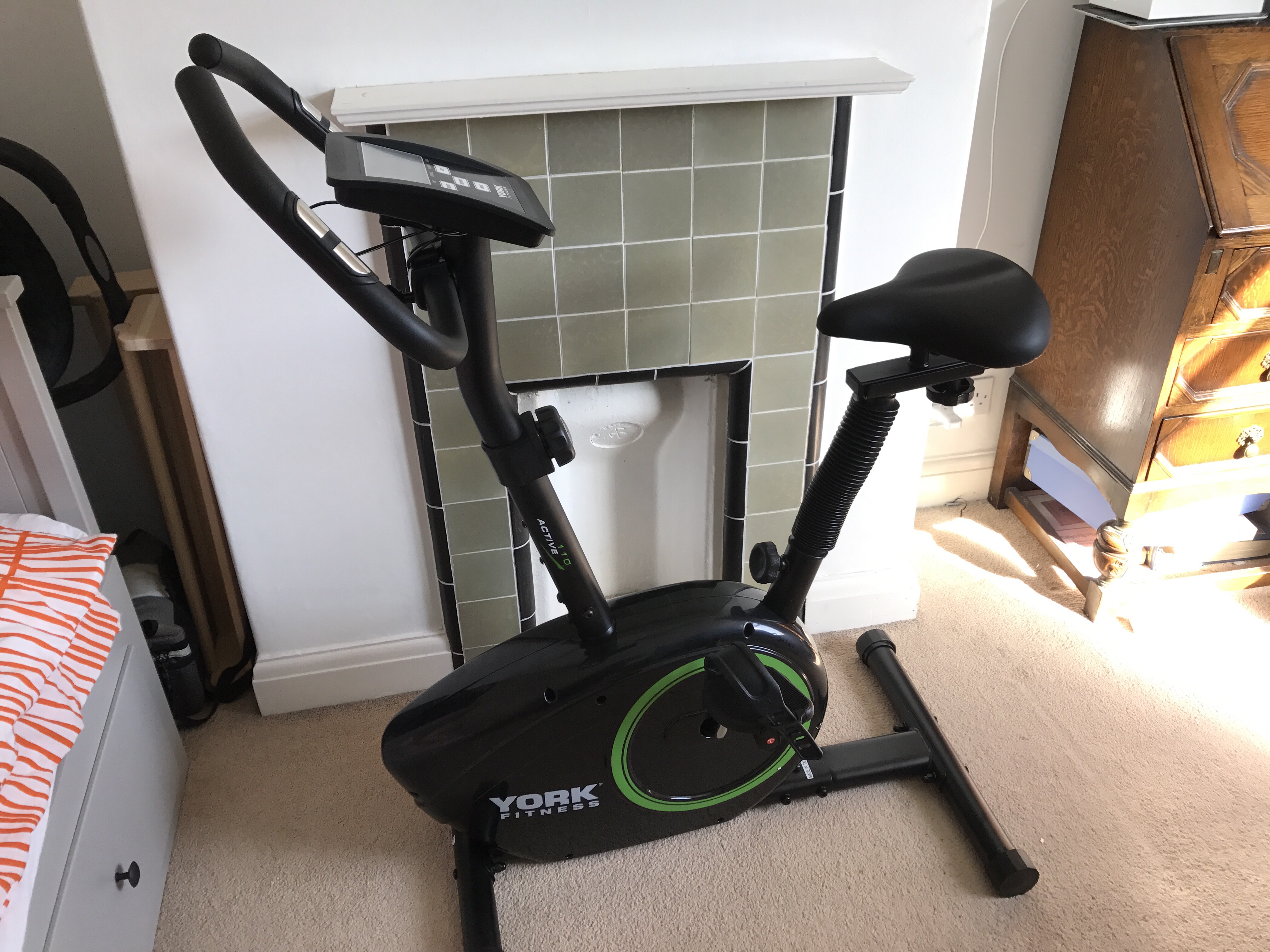
It’s so easy just to climb on and crank out some kilometers and burn calories. Even if it’s the end of the day and I haven’t hit my goal, it requires almost zero motivation or energy to just walk over to it, get on, and go. If I was relying on running as my daily exercise, I’d be very reliant on the weather and whether I even feel like getting dressed in the appropriate gear and leaving the house. The bike reduces the barrier to entry, and I can’t recommend it enough. I can even prop my iPad on the console and watch YouTube or Netflix while I ride.
Get Fit With This One Weird Trick
If you’re looking to lose weight or get fitter yourself, hopefully this post has given you some ideas and inspiration.
My inspiration for this post, as well as for me to finally try to get fitter, was Matt Gemmell’s excellent post from a couple of years ago, Workout. Matt went through a similar journey, and the results he saw in six months are just incredible. I highly recommend checking it out.
Inspecting iOS State Restoration Data
State preservation and restoration allows iOS apps to save state when they’re sent into the background, and restore that state if the app is killed and then relaunched. If you’ve ever implemented state restoration yourself, you may have run into a case where it’d be helpful to see exactly what state iOS was storing.
It turns out that Apple actually provides a tool to help you do just this, but it’s kind of hidden away and documentation is relatively sparse. Fortunately, it’s pretty easy to use. When you run it, it’ll output a structured plist showing all of your encoded objects, their restoration identifiers, and restoration class information. Here’s a step by step guide.
The Nintendo Switch and The Legend of Zelda: Breath of the Wild
My first impressions of Nintendo’s latest console and its flagship game.
It’s hard to separate the Nintendo Switch and The Legend of Zelda: Breath of the Wild when considering their relative merits. The two were released on the same day, and for most people the Switch is ‘just’ going to be a Zelda machine for some time due to its meagre launch lineup.
And that’s fine.
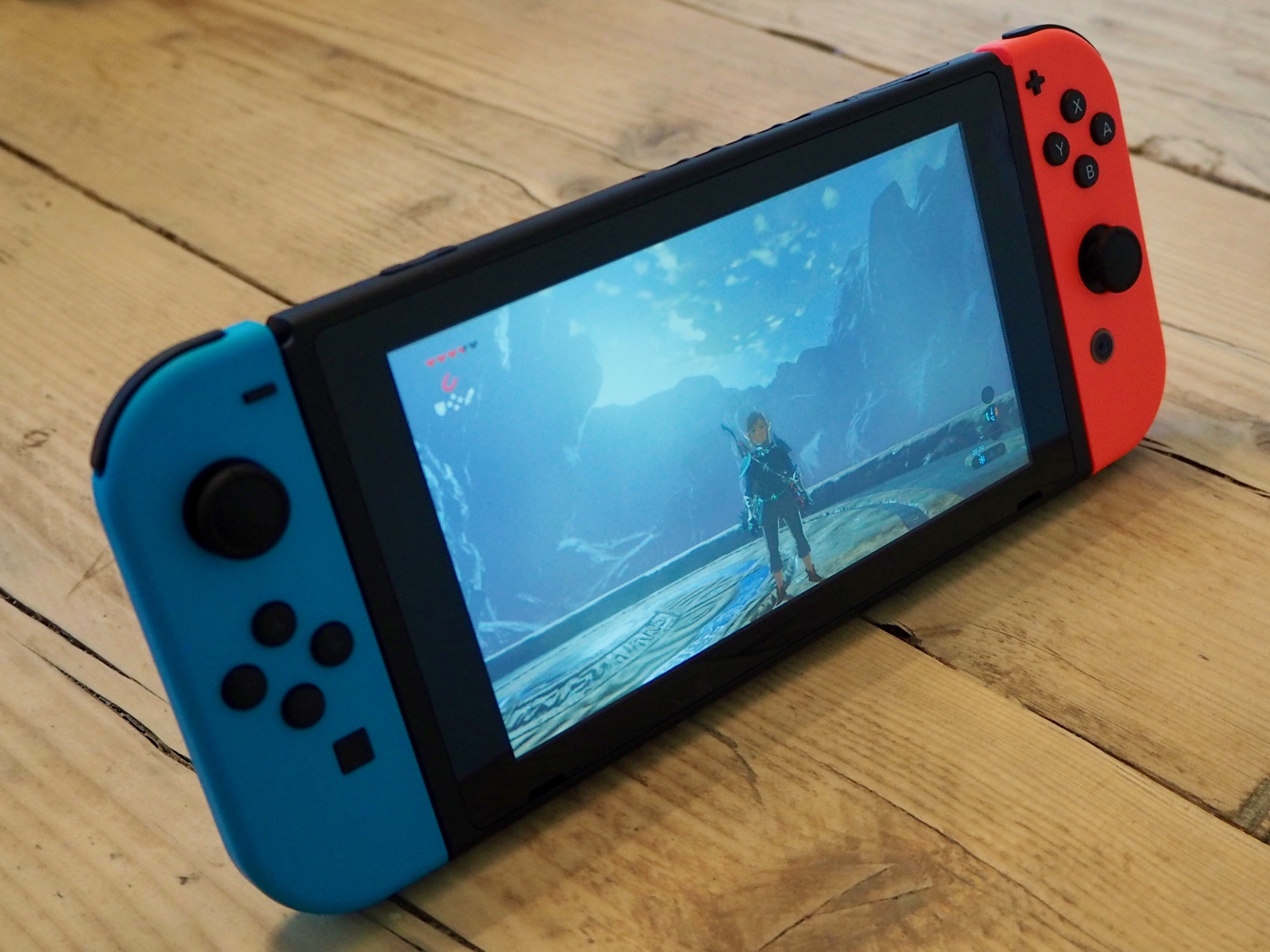
I originally preordered the Switch as soon as preorders were available, but ended up cancelling it shortly before the Switch’s launch. I was bitten 5 years ago by the 3DS – there were almost no games worth playing at launch, and then the system received a price cut of about 1/3rd just 4 months after it was released. Fool me once…
But then the Zelda reviews rolled in. Everyone who’d got a Switch already seemed to love the console, and Zelda was getting almost universal praise. Despite the Switch being sold out everywhere I managed to catch them in stock for a very short period at Nintendo UK, put in my order, and it arrived the next day. So how is it?
The Switch
In my opinion, the Switch is the best hardware Nintendo has produced in 10 years, since the original Wii and the DS Lite. For the most part, it’s really well built and the design is minimal and unfussy. It’s nice and compact, but the screen and controllers are just about big enough. The tablet is also reasonably light and reasonably thin (here’s a comparison to the iPad and iPhone, if you’re interested).
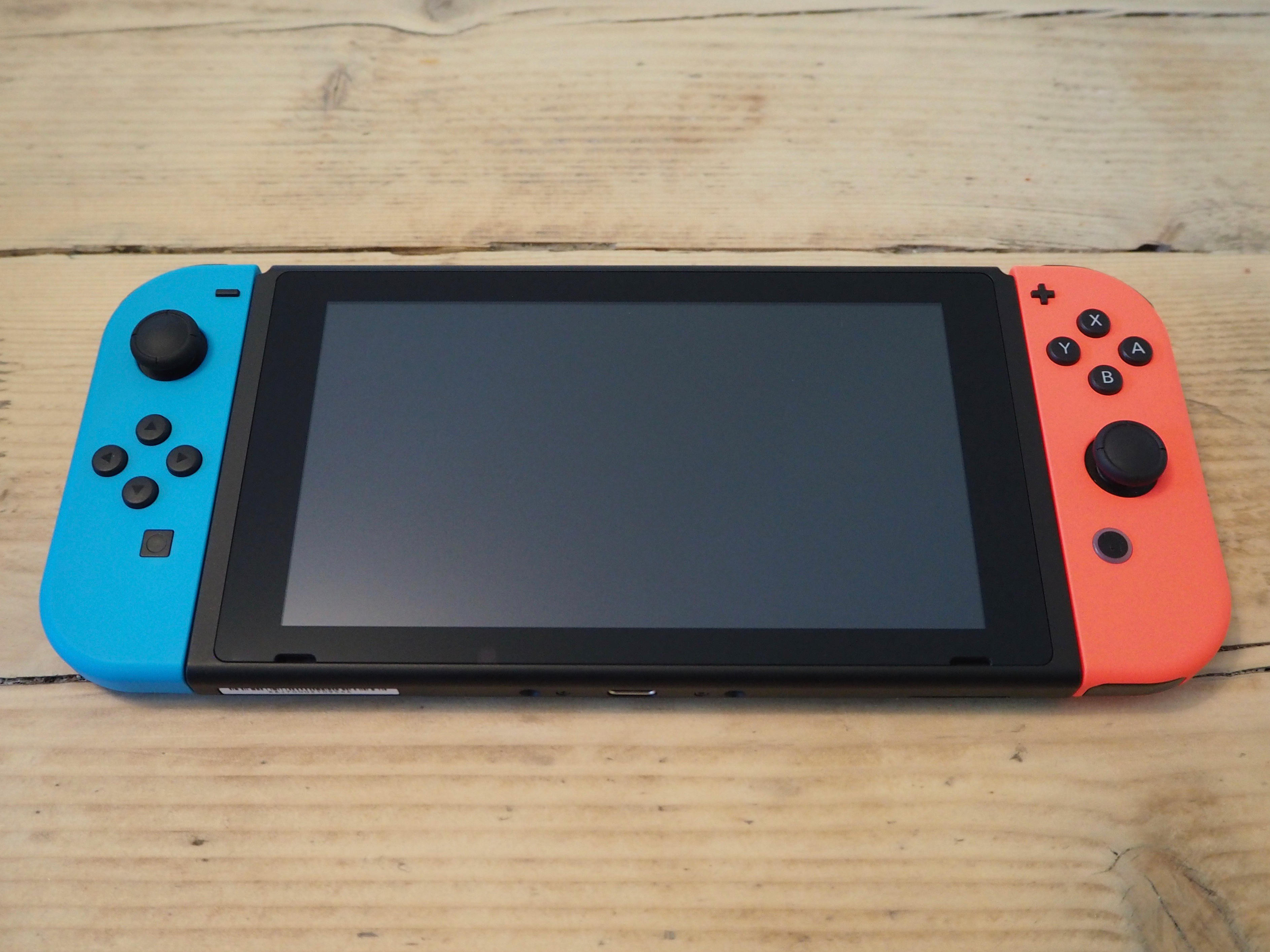
The 720p screen is high quality, and in a first for Nintendo it uses capacitative touch instead of resistive touch. It feels much more modern than the 3DS and the Wii U, both of which had terribly low resolution screens with large gaps between the display and the ‘glass’. It’s the first time I’ve been really impressed with a Nintendo display in a long time (or perhaps ever?).
The system software also feels much more modern than anything Nintendo have put out before. It’s got a very nice clean UI, without any of the ‘chintz’ that I typically expect from them – pinstripes, bubbley 3D buttons and the like. It’s also nice and fast, and feels like it’s actually capable of handling several tasks at once. The 3DS and Wii’s software always felt very modal to me; you had to stop one thing to do another. It certainly feels like a version 1.0 though, and I’m excited what Nintendo add to it in the future.
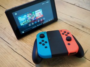
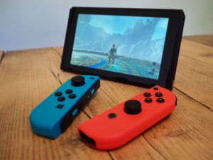
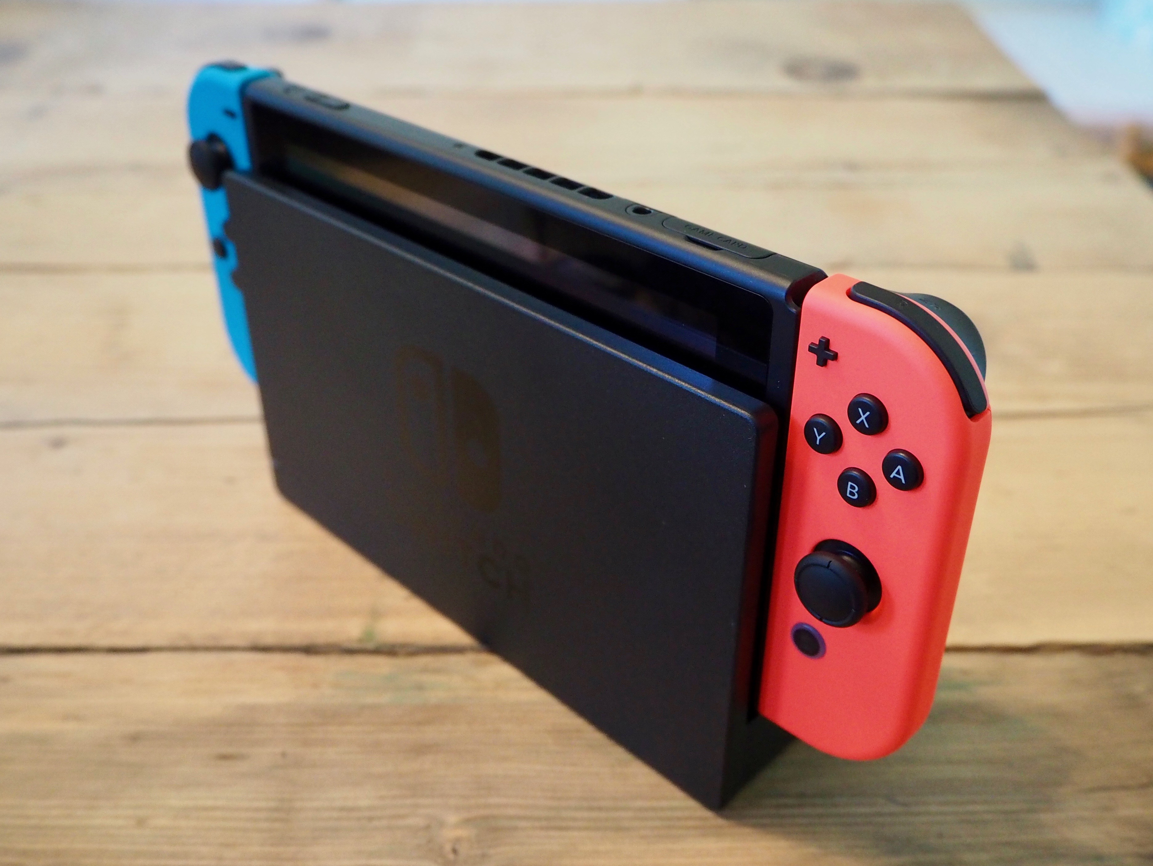
I think my favourite part of the whole system is its flexibility, which is of course the main selling point of the whole system. You can dock it and play on your big TV, or pick it up, slide in the controllers and play it handheld. Or you can prop it up, slide out the controllers and play it in ‘tabletop’ mode. Or stick the controllers into a grip and use them in a more traditional configuration. I’ve found myself switching between all the different modes and it feels great in each. It’s also really easy to switch between them.
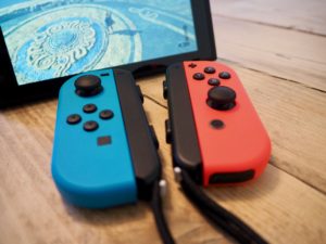
The Joy-Con controllers feel nice in the hand, but can be a little fiddly. The shoulder buttons in particular are quite small and close together, and if you’re not using the controllers in a grip it can be hard to switch your fingers between them – there’s not quite enough to hold on to. That said, I do really like them (the neon coloured versions are amazingly bright – photos don’t do them justice), and the Switch’s flexibility means you can use them however is most comfortable to you: in a grip, held individually, attached to the Switch itself… There is also a ‘Pro’ controller available, which I haven’t tested myself but I’ve heard good things about.
I also think it’s utter genius that each console effectively comes with two controllers. When Mario Kart launches, you’ll be able to play two player local multiplayer right out of the box.
We only have one TV in our house, so I often find myself playing my PS4 via the PS4 Remote Play app on my laptop if my wife is watching TV. It works well enough, but of course a lot of visual fidelity is lost due to video compression when streaming. The Switch, then, is the perfect fit for me as it’s designed around this exact use case. The visuals are excellent when playing handheld. In fact, Zelda actually seems to perform better in handheld mode, with fewer frame rate drops but no noticeable difference in quality.
The only piece of Switch hardware that feels lesser quality to me is the TV dock, which is a bit of a disappointment. It’s a lightweight, slightly flimsy-feeling block of plastic, although I do like the glossy Switch logo on the side of it. The Joy-Con controllers are so satisfying to slide onto the Switch itself – they snap into place with a pronounced click, which is mirrored by a visual effect on the screen and a sound played by the system software.
The dock has no such satisfaction. There’s nothing to really guide the Switch into the right place and it just spongily makes contact with the bottom of the dock with a bit of a bounce. It never really feels like it’s in there properly. I wonder if Nintendo will improve this with future revisions.
Whilst reading my first draft of this post, I realized I forgot to mention the battery life of the Switch. That’s because so far it’s never been an issue for me. It’s far better than I was expecting, and I’ve never found myself running out of battery when I want to keep playing.
Pros
- Finally, modern hardware and software from Nintendo that feels competitive with smartphones / tablets and other consoles.
- Great feeling hardware (tablet and controllers) with excellent build quality.
- Flexibility of play styles, which is easy to do and very well executed.
- Battery is better than I was expecting.
Cons
- Dock feels flimsy and is awkward to use.
- Very few games so far. But Mario Kart, Splatoon, and Mario Odyssey are coming. Also, Zelda.
The Legend of Zelda: Breath of the Wild
Zelda is the Switch’s flagship game, and by all accounts is a real system seller. And with good reason. It’s excellent.

It feels like a Zelda game, but it’s also completely different from any other Zelda game. Pretty much from the get-go, you can go anywhere, tackle anything in any order you want, and there’s no hand-holding. The world is big. You won’t believe just how vastly hugely mindbogglingly big it is. There’s always somewhere new to explore, or some side quest to get lost in. The world also has a really interesting physics engine behind it all, which opens up all sorts of possibilities for combining different items. Shoot an arrow through a campfire into a tree and the whole thing will go up in flames. The joy is in the emergent gameplay that crops up through these interactions.
The game’s openness works really well with the Switch’s flexibility and portability. The system sleeps and wakes instantly, so you can carry this vast world around with you and drop in and out whenever you like. And if you feel like it, you can play it on the big screen too. I can see myself dipping into this world for many months (or years) to come.
I will say that whilst I am absolutely loving the game, I don’t think I agree with all of the 10/10 scores it’s been receiving. It’s definitely a 9/10 and probably even a 9.5/10, but I think it’s slightly let down by a couple of issues. It’s technically impressive what Nintendo manage to pump out of this small portable device but after just finishing Horizon: Zero Dawn on the PS4, with its lush, richly detailed landscapes Zelda feels a little lacking in places. For example I’ve come across mountain peaks with very low model and texture details: smooth domes with quite low resolution textures smeared across them and no extra set dressing. It’s perhaps a little unfair to compare the two games, but it doesn’t stand up to Zero Dawn‘s incredible world.
Objects also pop in and out of existence at a little closer distance than I’d like. You’re able to get a telescope-style zoomed view to look at the landscape around you, but it’s hard to scope things out when any enemies that may be in the distance don’t get rendered. You’ll also occasionally see super low-polygon versions of structures that are a long way off. The world is certainly beautiful, and moments regularly crop up that make me just stop in my tracks to admire the scenery. It’s just that these technical issues occasionally do crop up and break the spell:

I’m not going to say too much more, because I think the fun in Breath of the Wild is all in discovering things for yourself. If you like Zelda games you definitely need to play it. If you haven’t played them before, you should definitely give it a go.
Pros
- The perfect game for the Switch. Dive in and out whenever and wherever you like.
- An incredible, vast world filled with things to see and do and play with.
- An exciting new direction for the Zelda series.
- Combat is fun and satisfying. There are also many, many ways to tackle different encounters with enemies thanks to the physics system.
Cons
- Fiddly controls.
- Technical issues do let the game down in places. It’s not too often, but sometimes breaks the immersion.
- Voice acting is very hit and miss, and the dialogue is pretty poor.
Final thoughts
I’m really pleased with the Switch. The hardware is pretty perfect for a first revision. It’s very well built and well designed. Nintendo have finally produced hardware and software that stands up there with modern mobile devices, and it’s exciting to see where they’re going to take it. Having one device that works seamlessly from your living room to anywhere-else-you-want-to-use-it feels exciting and new, and it works exactly as it’s supposed to.
Zelda, too, feels like something new and is the perfect accompaniment to the Switch.
I really hope the Switch is as successful as Nintendo need it to be, and that they (and third parties) continue to support it with great games.
PlayStation VR
Ever since I first tried VR, I knew I had to own a headset. I finally do, and I’m really pleased with it.
I was more excited leading up to the release of the PlayStation VR than I remember being for any other recent tech product launch. Mine arrived last week and a lot of people have asked me what it’s like, so I figured I’d write up my thoughts.
The headset
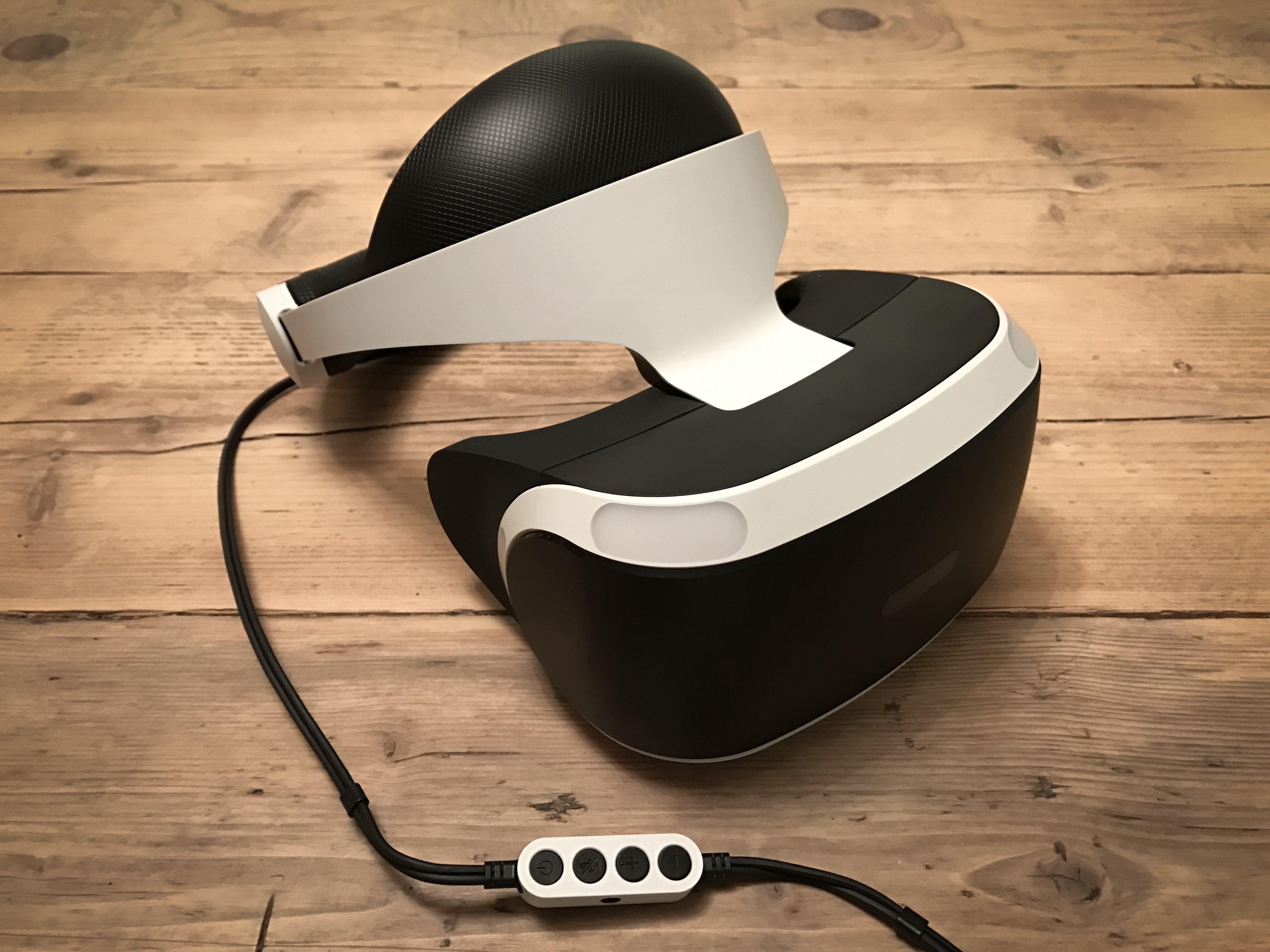
The headset itself is really comfortable. The design, build quality, and materials that Sony have used are excellent. The inner padding of the headset is a really nice textured rubber, and it feels great and looks very premium.
The headset is also very easy to put on. No awkward velcro straps like the Vive or Rift. There’s just a sturdy band that fits around your head, and a small dial to turn to tighten it once it’s on. Once it’s in the right place you can slide the actual visor (containing the screen) forward and backward, so you can move it closer to your face and find the ‘sweet spot’ where it’s in focus. Whereas the Vive and Rift screens are pulled tight against your face like a pair of ski goggles, the PSVR comfortably hangs in front of your eyes.
And it works really well with glasses! Sony paid particular consideration to users with glasses, and for me at least it’s very comfortable. Whenever I’ve used a Vive or a Rift in the past, I’d have to put it on in an awkward way to fit around my glasses, and they’d get stuck inside it when I took it off.
There’s a small amount of ‘light leak’ at the bottom of the headset, where you can see the real world if you look down. Apparently this was an intentional design on Sony’s part, to allow people to ‘ground’ themselves if necessary. I have to say that once I’m playing a game, I don’t notice it at all.
Setup was very easy, despite there being quite few cables involved. The cable from the headset to the processor unit1 felt to me to be much thinner and less intrusive than either the Vive or the Rift’s cables. It also contains a useful little inline remote into which you can connect a pair of wired headphones (which receive full 3D audio). The remote allows you to change the volume, turn the headset on and off, and mute or unmute the headset’s microphone.
The screen
I’m impressed by the quality of the PSVR’s display. The colours are great, it’s bright, and there’s little to no screen door effect2. It’s not the highest resolution (it’s marginally lower than the Vive and the Rift), but I can live with that as it’s just a reality of where VR tech currently is.
It also seems like it’s the games that are mainly letting things down on the resolution front – in a game that’s rendering at a resolution higher than that of the panel (‘supersampling’), such as Job Simulator which runs at 1.4x resolution, things look quite sharp. Other games are clearly running at a lower resolution in order to get the required performance, and it shows. EVE: Valkyrie in particular gets very blurred at a distance, and whilst I haven’t played it I’ve heard that Drive Club has big resolution issues. I think the PS Pro should help in this regard, as it’ll allow games to render at higher resolutions.
The only other issue I have with the screen would be that it has a fairly prominent ‘mura effect’ in dark scenes. This is where you can see a random pattern of slightly lighter coloured pixels across the screen. It essentially means that dark / black scenes aren’t truly black, and instead are like looking at a dark grey textured pattern which moves with your head. It’s not awful, and it’s easy to look past, but it’s there.
The experience
If you’ve never experienced VR for yourself, it’s difficult to convey what it’s like. Not only does the game surround you everywhere you look, but the sense of depth and scale is incredible. It’s like nothing else. The head tracking on the PSVR generally works really well; the framerate is excellent, and the gameplay very smoothly follows your head movement.
Head tracking in general works well, and rotational tracking (tilting your head to look in different directions) is certainly spot-on. I’ve had a few small issues with positional tracking (your 3D positioning in the world, as you move forward / backward / left right) in some games and when sat further away from the camera. In particular, in the demo of Job Simulator, the environment around me continually moves forward and back slightly whilst I’m stood still, which can result in you feeling a little weird / drunk.
Both headset and controller tracking3 rely on the PlayStation Camera (required for PSVR, but not included with the headset) tracking the visible light from their bright LED strips. Occasionally the controllers also suffer from some ‘jitter’, and if their LEDs aren’t visible to the camera they can disappear in games entirely. For the most part it works well enough, although one can certainly question Sony’s decision to base fairly critical parts of PSVR on slightly flaky 6 year old technology (although presumably cost was a big factor). Having used both the Oculus Rift and HTC Vive, I can say that both of their tracking systems are rock solid in comparison.
The tracking is my only real complaint about the whole experience, and it’s not enough to put me off PSVR or rely detract from gameplay at all. Most of the time it’s fine, and I think as a more technical user I’ve actively been analysing how well things perform and looking for problems. Most people probably won’t even notice.
Final thoughts
Ever since I first tried VR, I knew I had to own a headset. I finally do, and I’m really pleased with it.
Sony have done a good job of delivering convincing, immersive VR at a much lower price than either the Vive or the Rift. And that’s just the cost of the headset – I also don’t need to buy or maintain an expensive PC, which is a huge plus for me. Whilst the visuals may take a bit of a downgrade, and the tracking isn’t as good, it’s plenty good enough to fool your brain4 and there are some fantastic games and ‘experiences’ available.
In fact, I think one of PSVR’s stand out features (besides cost and easy of use) is that it has a great lineup of launch titles. In the next post, I’ll give a brief opinion on each of the games I’ve tried so far.
- A small box that connects to your PS4, which handles splitting the HDMI signal to the TV, 3D audio, and the PSVR’s ‘cinematic mode’. ↩
- Screen door effect is where you can see black lines between the pixels of a VR headset (hence it’s like looking through a fine mesh / screen door). Apparently the PSVR largely avoids this due to having full RGB subpixels, although I don’t really understand the technicalities of it. ↩
- The standard Dual Shock 4 and the PlayStation Move controllers can be used in various games, and they often have a virtual representation in the game. ↩
- I’ve not suffered from any motion sickness from PSVR (although many people do get it from certain VR experiences), but it’s triggered my fear of heights many times. Whilst I know there’s no danger – I’m sat in my living room, after all – the experience is convincing enough for my brain to momentarily go AAAAAARRGGH. It’s kind of fun though. My favourite is currently in RIGS, where you get launched 60 foot into the air out of your RIG whenever it explodes. ↩
WWDC 2016 Developer Tidbits
A collection of some of the smaller Xcode, iOS, and watchOS changes I’ve come across whilst reading Apple’s updated developer documentation during WWDC.
There were some nice announcements from Apple at WWDC yesterday, including a revamped lock screen and notifications for iOS, SiriKit, and a lot of iMessage integration. Whilst scouring the newly-released developer documentation I’ve come across a lot of interesting tidbits that aren’t headline features on their own, so I thought I’d collect them here in case they’re of use to anyone else. In no particular order:
Xcode
- Some nice improvements to Interface Builder. You can now edit your UI at any zoom level (FINALLY)! The UI for customizing layouts for different device traits has also been revamped, and looks really good.
- Image and colour literals are now supported in Swift code, including code completion for images that’re in your asset catalog. Simply start typing either
colororUIImage. - There’s a new monospaced code font in Xcode:
SF Monothat seems to match up with the WWDC promo material this year. - The simulator features a special version of the Messages app which allows you to see both halves of a conversation between two users. Very useful for testing all the iMessage newness.
- Xcode 8 supports both Swift 2.3 and Swift 3. If you choose Swift 2.3 for a project, there’s a new build setting that gets set to Yes: “Use Legacy Swift Language Version”.
- The new memory debugger looks incredible. You can visualize the current object graph, and it can help identify memory leaks / retain cycles.
- Xcode now highlights the active line when editing.
Foundation
- There’s now
NSDateIntervalfor counting the duration of a time interval, checking whether a date exists in a range, and comparing intervals. - FINALLY an ISO 8601 date formatter.
NSPersonNameComponentsFormatterhas a newpersonNameComponentsFromString:method that can parse out the individual components of a person’s name.
Notifications
- The User Notifications UI framework lets you customize the appearance of local and remote notifications when they appear on the user’s device.
- You can also intercept push notifications (through
UserNotifications.framework) and handle them before they alert the user. For example, you could download a video and then tell the user it’s ready. - Rich notifications are currently only optimized for 3D Touch, and they’ll be providing access to functionality for users of other iPhone models / iPad at a later date.
- A lot of the existing remote and local notification methods on
UIApplication(as well asUILocalNotificationitself) are now deprecated in favour of theUserNotificationsframework.
UIKit
- There’s a load of new animation APIs: “New object-based, fully interactive and interruptible animation support that lets you retain control of your animations and link them with gesture-based interactions.”
- The refresh control is now supported in all scroll views and scrollview subclasses thanks to
UIRefreshControlHosting. - Collectionviews and tableviews support prefetching of cells to improve scrolling (
UICollectionViewDataSourcePrefetchingandUITableViewDataSourcePrefetching) - It looks like you can now provide your own previewing UI for 3D Touch:
UIPreviewInteraction. - There are new UIVisualEffectView blur types: prominent and regular.
Core Data
NSPersistentContainerlooks like it might replace the simpleCoreDataStackclass I’d add to most new projects. It encapsulates the whole core data stack, and has convenience methods for creating new background contexts and performing background tasks.NSManagedObjectgets a few new methods –init(context:),fetchRequest(),entity().- Xcode should be able to automatically generate classes for Core Data entities, but I’ve been unable to get this to work so far.
NSManagedObjectContextnow has anautomaticallyMergesChangesFromParentproperty to do theNSManagedObjectContextDidSaveNotificationobservation and merging automatically.
Swift Playgrounds
- On iPad,
XCPlaygroundis replaced byPlaygroundSupport. - You can record videos of coding sessions right inside the app (in the Share menu).
watchOS
- Glances have gone completely in watchOS 3. Your app should now display and update glanceable information when the user has it in their Dock.
- If the user has your complication on their watch face, your app will be kept in a ready-to-launch state.
WKCrownSequencerlets you directly access information about the crown’s state – whether it’s rotating, how fast, and when it’s stopped.- SpriteKit and SceneKit on the watch is cray-cray. The State of the Union contains a cool demo where a notification on the watch contains an animated 3D SceneKit scene.
- You can now access information about the watch’s orientation, crown position, wrist location, etc in
WKInterfaceDevice - If you’re using a watch app, whenever you lower and raise your wrist, you’ll get taken right back into the app, for up to 8 minutes.
SiriKit
- SiriKit is limited to only certain domains:
- Audio or video calling
- Messaging
- Sending or receiving payments
- Searching photos
- Booking a ride
- Managing workouts
Misc
- If you’ve indexed content for your app with Core Spotlight, you can now search it programmatically in-app using
CSSearchQuery. A user can also continue a Spotlight search inside your app. - Speech recognition is now possible, through the Speech framework and
SFSpeechRecognizer. - You can set an expiry or exclusions for pasteboard data for the new universal clipboard.
- iOS 10 drops support for the iPhone 4S, iPad Mini, iPads 2 and 3, and the 5th generation iPod touch.
