Original Game Boy Backlight Mod

Following my Game Boy Advance screen mod, I decided to try modding an original Game Boy.

There are several screen mods available for the original Game Boy1. Just like with the Game Boy Advance there are IPS screens available, which give you the best image quality. You can also keep the original screen but add a backlight to it, which is what I opted to do. This is much cheaper, and also gives a result closer to the look of the original display.

Supplies

The first thing I needed was a Game Boy! My brother and I had a yellow ‘Play It Loud’ edition when we were younger, which came bundled with a yellow Donkey Kong Land game cartridge. Unfortunately while I have our original games, I’ve been unable to find the Game Boy itself – so I bought another on eBay:

Except for needing a bit of a clean and having a few small scratches on the screen, it was in very good condition.

Next, I picked up a ‘lemon yellow’ backlight kit from Deadpan Robot, as well as a bivert chip. Just adding a backlight makes the screen brighter, but it also washes out the picture. A bivert chip inverts the pixels and in turn increases the contrast. It’s recommended to install one if you’re adding a backlight.

The Mod

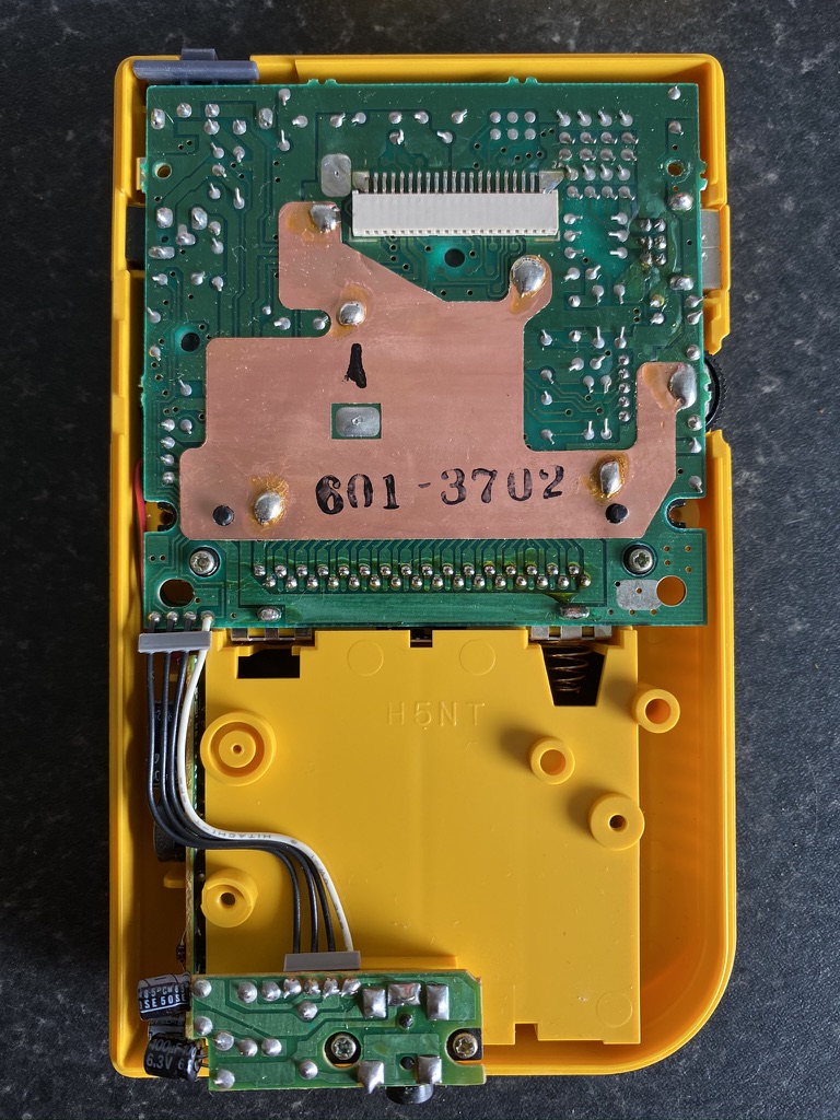
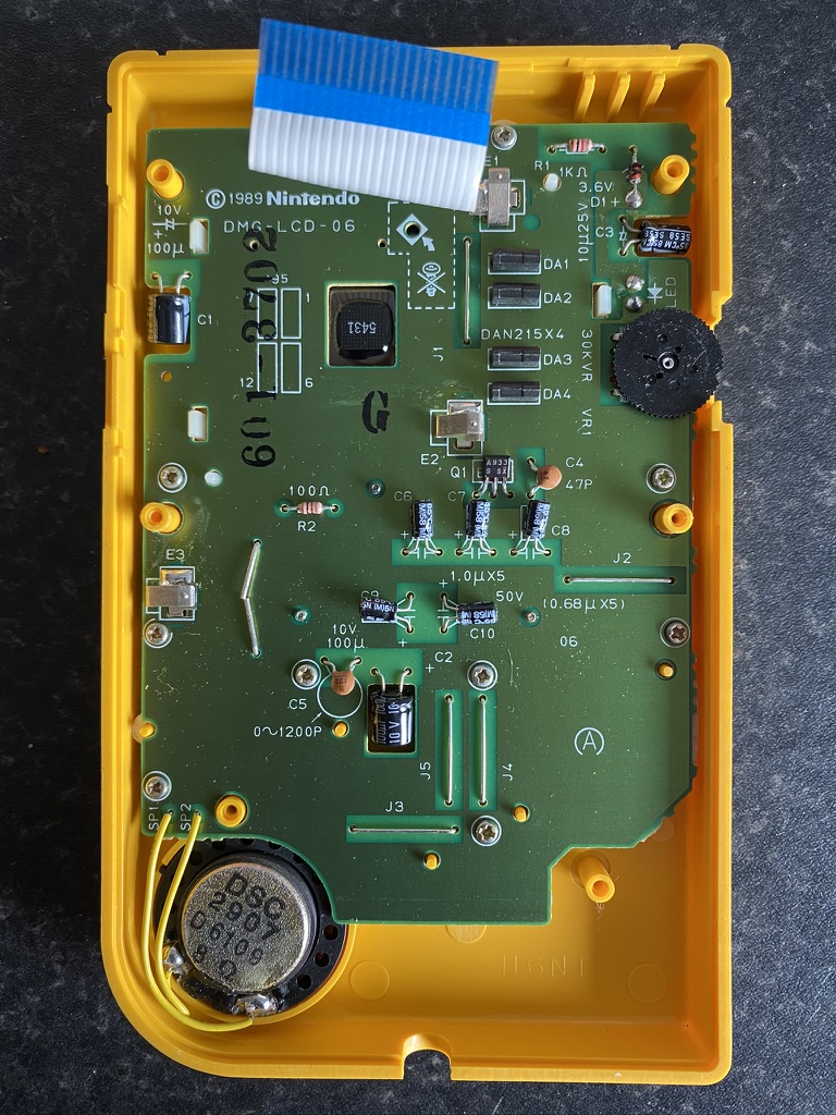
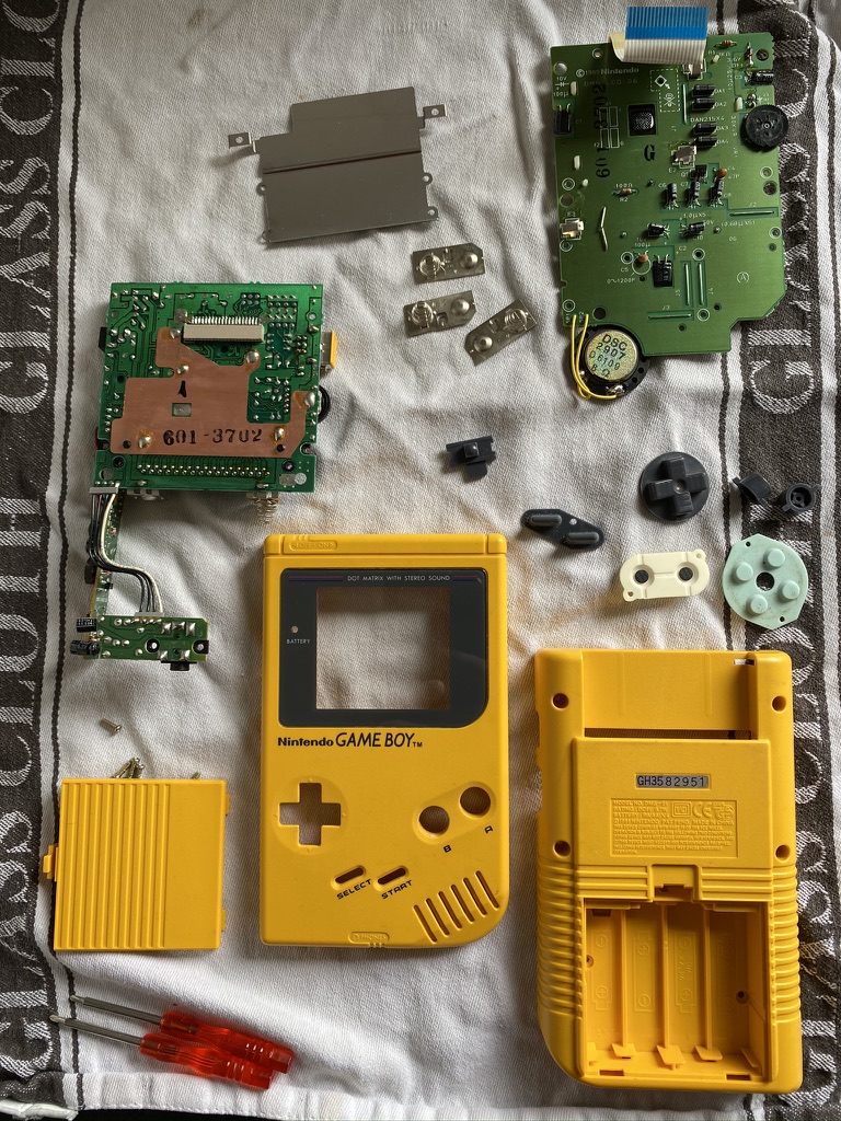
The first step was to disassemble the unit. I also washed the casing, buttons, and silicon pads with mild soapy water.

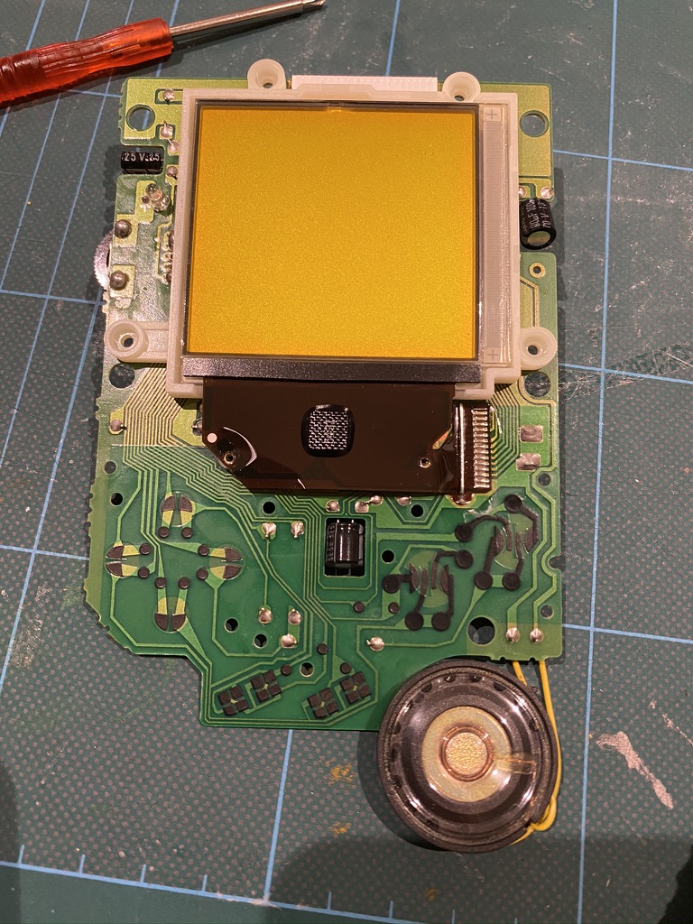
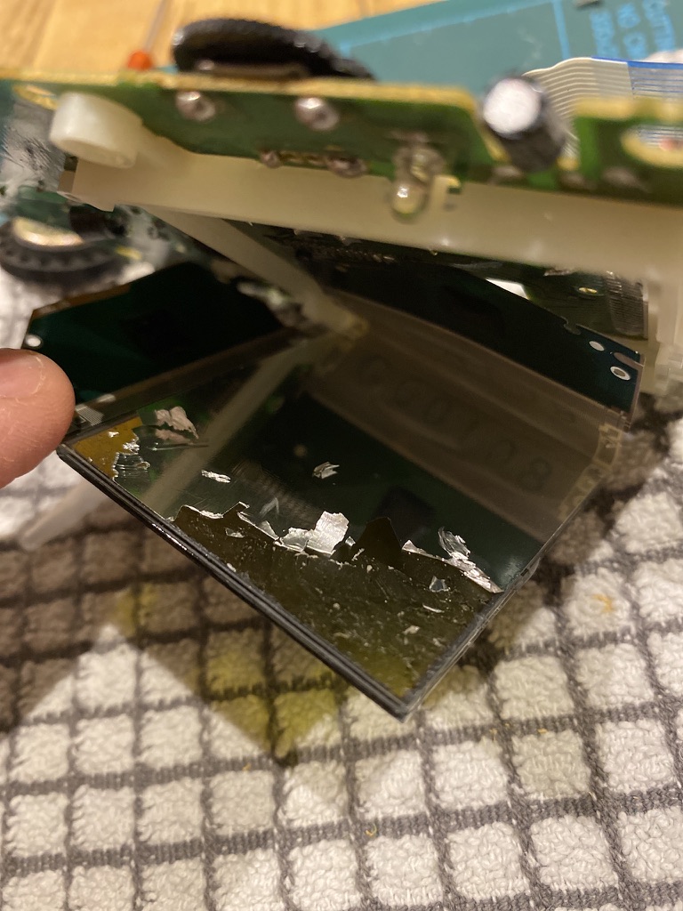
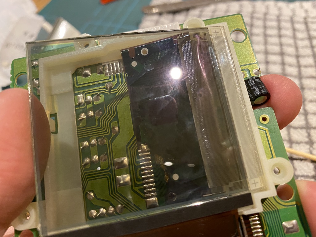
And here’s the screen itself:

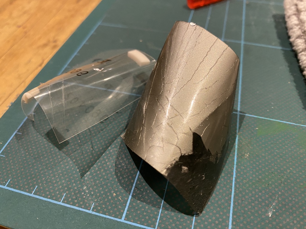
To install the backlight unit, you first need to remove the existing reflective backing and polarizer from the screen. This proved to be quite tricky. At first I was just scraping the foil off, nervous of damaging the screen, but then I got more confident and managed to get a craft knife underneath the polarizer layer. This made it easier to peel the whole thing off in one go.

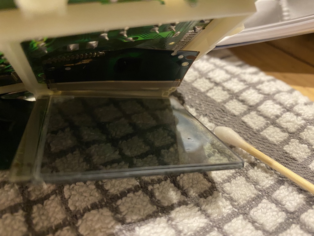
The thing that makes it particularly difficult is that the screen remains attached by a very delicate ribbon cable, so access is tricky. After peeling the polarizer off, I cleaned off the remaining glue with some isopropyl alcohol.

The new backlight panel (a piece of plastic with some LEDs attached to the bottom) slides in behind the LCD, and the polarizer goes in between. You have to make sure the polarizer is rotated the right way so that the pixels will be visible. The guide I was following also recommended lightly dusting the polarizer with baby powder or diatomaceous earth to avoid it sticking to the screen.

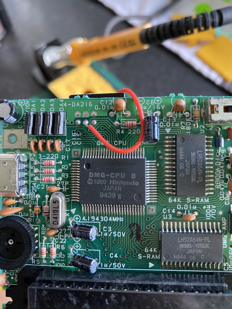
Finally, the two wires coming from the backlight panel needed soldering to the main board along with a resistor.

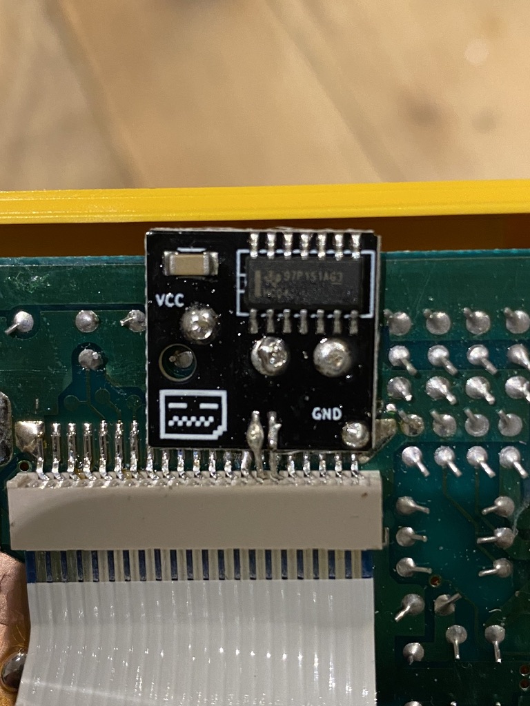
Next, I installed the bivert chip. To do this, you need to desolder and disconnect two pins on the screen cable connector, insert the board underneath, and resolder it. At first I miscounted and lifted the wrong pin, so I tried resoldering it as best I could, crossed my fingers, and finished the installation.

I powered it up and there was light! But no picture 😬

Troubleshooting

I knew the Game Boy as a whole was still working correctly, as I could hear the audio for the game. I guessed that the culprit was either my shoddy soldering on the bivert chip (turns out soldering is harder than I remember!), or I didn’t repair the damage correctly when I lifted the wrong pin.

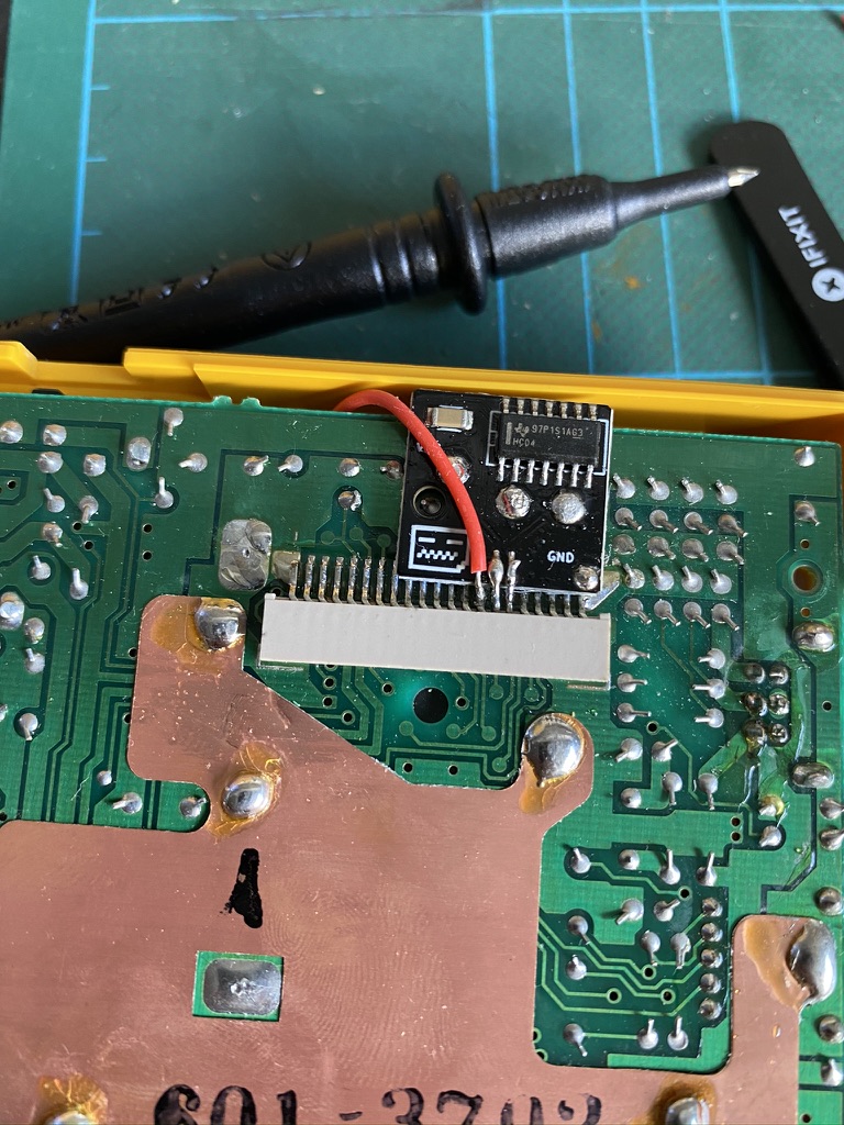
It turned out to be a combination of both. After some testing with a multimeter (and a lot of help from @SofaRacing and @elsmorian), I discovered that one of the solder connections on the bivert board wasn’t making contact properly (so I re-did it), and also that there was no connection between the pin I lifted and its intended destination.

To work around this I added a new wire that ran from the pin, over the top of the board, to the other side. I couldn’t help but think about the similarities with writing software as I was debugging the issue and fitting my workaround.

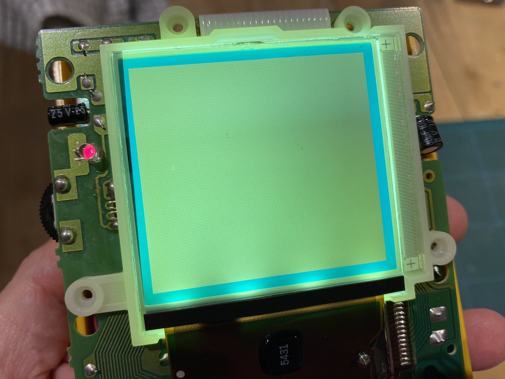
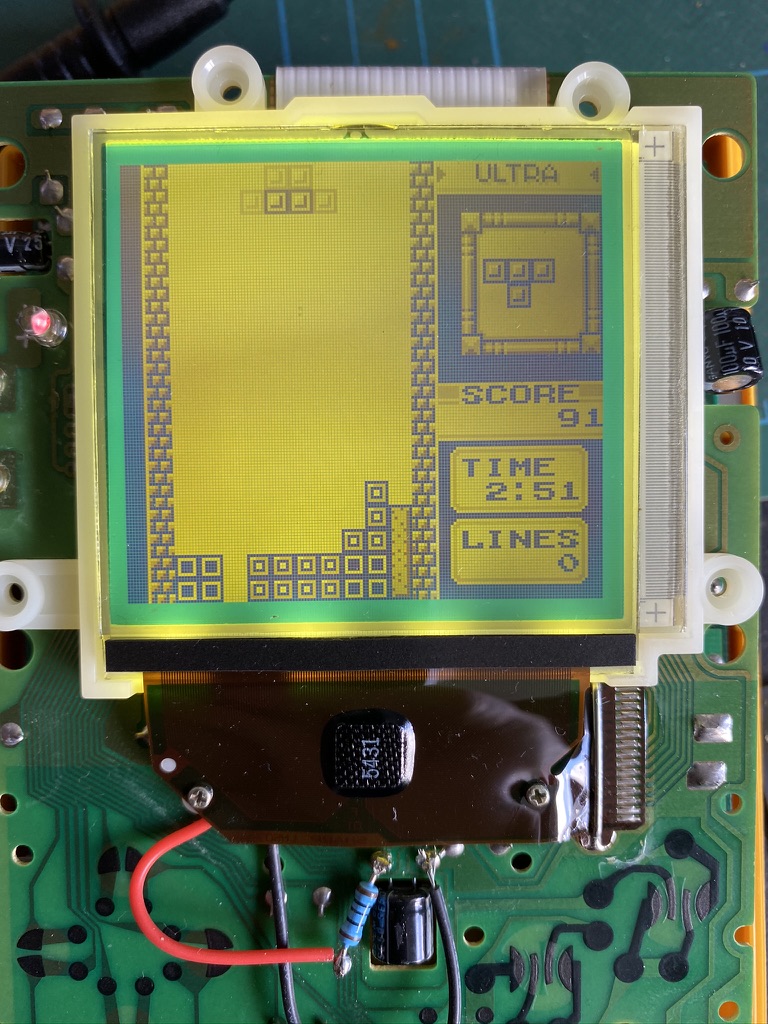
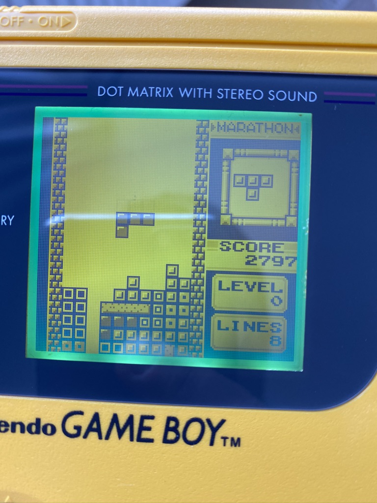
I turned the unit back on, and there was a picture! Tetris looked great with the backlight:

Wrapping up

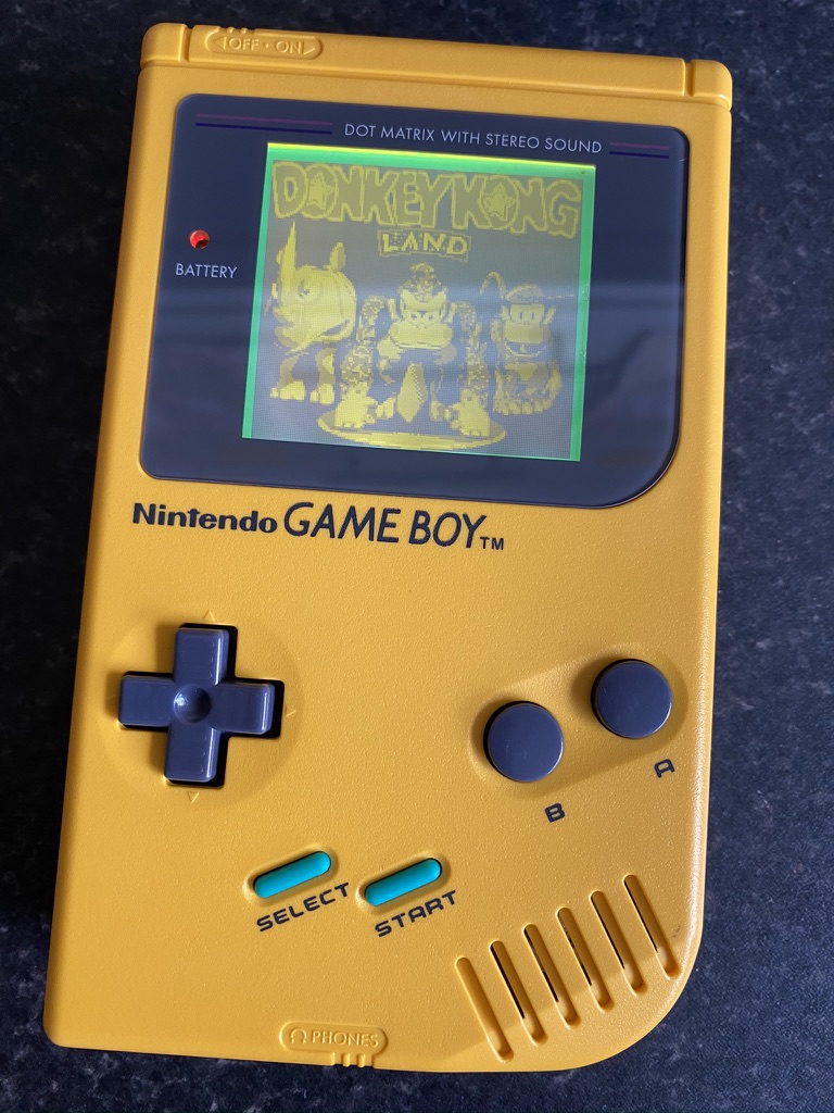
I finished things up with a new glass screen lens, and new start and select buttons to match the cyan border around the screen.

It wasn’t the neatest installation, but I was pretty happy for my first attempt. The finished device looks great.


  1. Also known as the DMG because of its model number: DMG-01. DMG stands for Dot Matrix Game. 

Game Boy Advance Screen Upgrade

I recently picked up a new screen and outer shell for my original Game Boy Advance.

The original Game Boy Advance screen is so dim that it’s hard to see it property even in a brightly lit room. I remember as a kid mostly playing with a special external light that clipped around the case. It had two arms that shone light down onto the display. Even with that, it still wasn’t great!

It also has a kind of ‘screen door effect’ between the pixels, so it looks pretty grainy.

I still love playing retro games from time to time, so I recently kitted out my Advance with an upgrade.

There have been a number of screen mods available for the GBA over the years. For a long time, the best improvement was to switch the screen out for the backlit screen that’s used in the Game Boy Advance SP. More recently, a better alternative has emerged: a large, even brighter IPS LCD panel.

The larger LCD requires some areas of the inner case to be cut out to make space for it. I didn’t fancy trying to do that, so I ordered a special pre-trimmed shell from RetroSix, along with the screen kit. RetroSix manufacture their own GBA shells ready for the new LCD (they said most aftermarket shells aren’t very high quality), along with optional modifications to fit a USB-C battery pack. If you’re in the US, I’ve heard that Retro Modding are a good parts supplier.

Installation

Installation involved opening up the Game Boy, disconnecting the screen and discarding the old shell, connecting the new screen, mounting it with adhesive and a 3D printed bracket (to get the correct positioning), screwing it all back together, and installing a new glass lens over the top.

RetroSix’s own instructions were fairly barebones, but I found a couple of different tutorials online that helped to guide me through it. The most problematic parts were:

  • Correctly aligning the screen when installing it. Now that it’s complete, I can’t help noticing that it’s a fraction of a millimetre down on one side.
  • Installing both the screen and the glass lens without getting any dust in between them. I did a decent job, but I can see one tiny speck under there. I think compressed air could help here.
  • The 3D printed bracket wasn’t super precise. I had to file down some parts of it, and I ended up removing one piece altogether as it was pressing into the back of the screen and causing a light area to appear.

Overall though, I’m very happy with the outcome!

Screen++

The screen is just in a different class to the original. It’s really bright, very clear, and has nice vibrant colours. The RetroSix shell is also very good, although I wouldn’t say quite the same quality of the original – it doesn’t feel as solid, perhaps. I love the gold holographic detail on the screen lens.

Here’s some very short videos showing each screen in action:

Before…
And after!

It’s also possible to solder in a couple of extra wires to allow for setting the brightness level of the screen by holding a couple of buttons down. I don’t currently own a soldering iron, so I’m saving this for another day!

Switching to Fastmail

Last year, I switched my primary email account away from Gmail to Fastmail. I’m very happy that I did.

Last year, I switched my primary email account away from Gmail. I’d been considering making this change for some time, and I’m very glad I finally did it.

Why switch?

I was increasingly bothered by Google storing all of my emails, which contain so much personal information. I didn’t want adverts to be pushed at me alongside my email. And for a service like email, I feel better if I can pay for it to support the provider through a revenue system that isn’t targetted ads.

Also, I use custom domains for my email, and setting that up with Gmail on iOS and macOS has always been a pain. In third party apps like Outlook you can add aliases, but the system mail apps can be tricky. And even if you do get it configured, it’s often added to the email header in a way that makes it clear it’s being sent on behalf of your @gmail.com address. I want to own my email address!

Enter Fastmail

I didn’t really research many options when I chose a provider. I’d heard great things about Fastmail, so that was the first and only place I went.

Fastmail is an independent Australian company that simply offers email services in exchange for money. This is great! It means they’re focused on running the service and making it better in order to keep receiving more money and provide a better service for their users. They’re big on open source and open standards – they just helped with the JMAP specification to replace IMAP, which enables them to provide a more modern email experience.

I really like their straightforward core values: their customers are customers, not a product; your data belongs to you; they’ll look after your data; and they’ll contribute to open source and improving email for everyone.

The Service

The first thing I was struck by was the quality of their experiences. Both their web and mobile apps offer a really clean user interface, and wow is it fast. They really earn their title. It feels to me, in a good way, like the ‘old’ internet, before everything was built on top of teetering piles of JavaScript. Pages load so quickly that they feel like static web pages. The UI is uncluttered, functional, easy to use, and very responsive. Through their work on the JMAP standard, they’ve recently added nice-to-have features like ‘undo send’ and snoozing emails.

I was also very surprised by their mobile apps. I’m an iOS app developer and an app snob, and if I’m honest I tend to look down on ‘non-native’ apps that use web technologies. I’m almost certain that Fastmail’s app isn’t native (it doesn’t feel native), but I really like it. It’s fast and clean and just works. It also offers one of my favourite features for any email client: I have the options to both archive or delete any given message. Many apps only give you one or the other of those options at a time.

The app also provides push notifications, and they’re incredibly fast. There have been numerous occasions where both my wife and I have been sent an email, and the Fastmail app will tell me about it tens of seconds before my wife’s Gmail app does.

Migrating to Fastmail

The process of migrating over to Fastmail was very simple. They have a migration tool where you can simply enter the credentials for your existing email service. They then begin importing all your emails into the correct folders, and they’ll let you know when it’s finished.

They also offer helpful guides to configuring your DNS settings to point your MX records to their mail servers, if you wish to do so.

No regrets

I’d recommend Fastmail in an instant to anybody who wants ownership of their own email. I feel like I am now in control of my own data. I’m also able to configure things like custom domains and spam filtering however I like.

I’d love to take this further by also moving away from Google for web search, but I’ve still yet to encounter another search provider that gives me the results I want to see. Last time I tried, Duck Duck Go still wasn’t there yet and I’d regularly have to go back to Google to find what I needed. For now, I perform most of my searches in a private browsing instance.

iPad Pro (2018) First Impressions

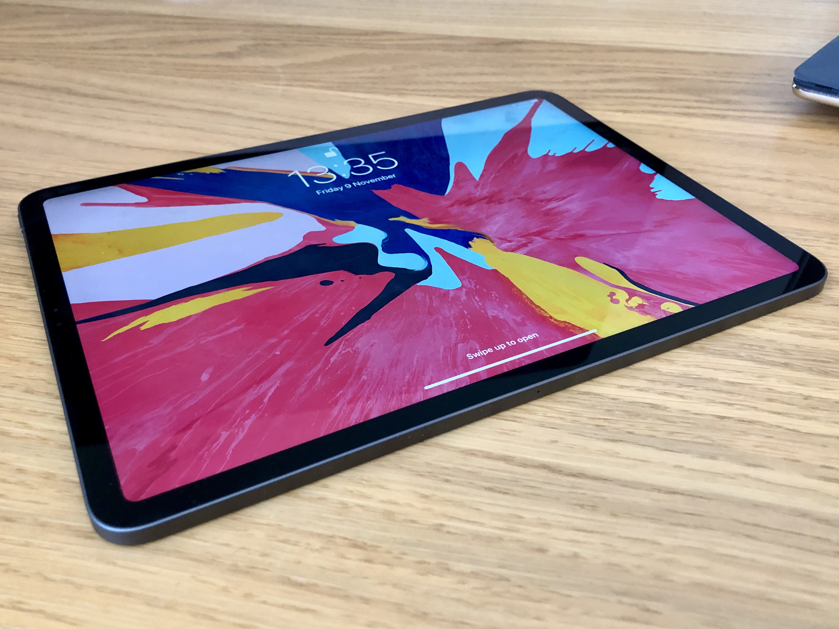
Some initial thoughts after trying out the new 2018 11” iPad Pro for a couple of days.

I picked up a new 11″ iPad Pro this week, to replace my original 9.7″ Pro. I’ve been using it for a couple of days now, so here are some of my initial thoughts in no particular order:

    I love the squared edges of the new design. I was surprised to read reviews saying how much thinner and lighter the new iPad feels, as to me it feels marginally thicker (even though it’s actually 0.2mm thinner). It’s also slightly heavier (about 30g). I hope this design is brought to the iPhone next year.

  • The screen feels much bigger (and it is!). iOS and its apps have more room to breathe. Although it would’ve been nice if it were a tiny bit wider to keep closer to the original 4:3 aspect ratio.
  • This thing is a fingerprint magnet! Seems to show up way more fingerprints than my original Pro.
  • I’ve not had a device with ProMotion before, and wow – animations feel super slick. Scrolls like butter.
  • I’m still getting used to how to hold the iPad now that it has thinner bezels. In one hand, you end up with your thumb resting on the edge between the front and side of the device, as the bezel isn’t wide enough to place your thumb there without touching the screen.
  • The majority of the third party apps I’ve tried so far haven’t been updated for the new screen size, which means black bars at the top and bottom of the screen. In landscape, this makes the new aspect ratio (no longer 4:3 on the 11″) even more obvious, and I’m still getting used to it.
  • Face ID works very well, but can be a little awkward in practice due to the camera being situated along just one edge of a device that can be (and is) used in any orientation. Now that the home button is gone, it’s not always immediately obvious where the front camera is when you pick up the iPad – particularly if you’re using it in a dimly lit room. For example, if I’m reading in bed I’ll often hold the iPad in portrait orientation and rest the bottom of it on the bed covers. But half the time it turns out that the iPad is ‘upside down’, so the Face ID cameras get blocked by the bedding. The iPhones X don’t have this issue because the notch helps you know which way is up.
  • This is an incredible, futuristic, fast device. It feels fantastic to hold, looks amazing, and is a joy to use. I’d love to use it for all my computing needs. Xcode for iPad, please!

And a few thoughts on the new Smart Keyboard Folio:

  • The new Smart Keyboard Folio is much sturdier than the old Smart Keyboard Cover, and is certainly much more stable when typing on your lap. The iPad can also now be positioned in at a shallower viewing angle, which is much nicer than the very steep angle of the old cover.
  • I was worried that it’d be difficult to put the iPad into / take the iPad out of the folio, but it’s actually very simple thanks to the magical array of magnets present in the new Pro.
  • The magnets are so strong, it’s now more difficult to collapse the iPad when it’s propped up in the folio. I haven’t yet worked out the right places to grab it without either touching on the screen or mashing on the keyboard.
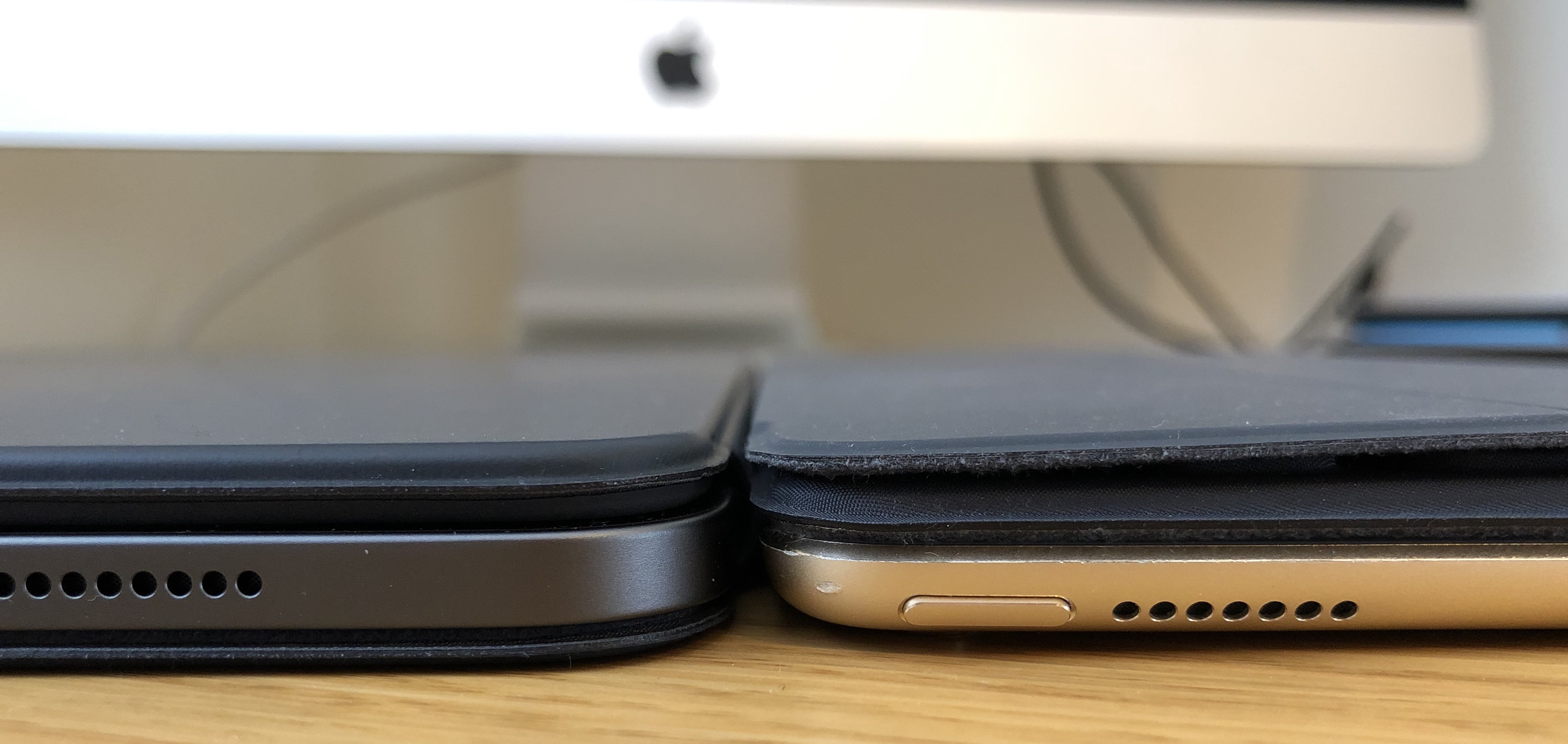
  • Because the new folio wraps around the front and back of the iPad it does increase the bulk, and it’s even heavier than the Smart Keyboard, which already added quite a lot of weight to the device. Laid flat, the new Pro in the folio is about the same thickness as the thickest part of the old keyboard cover:

The Nintendo Switch and The Legend of Zelda: Breath of the Wild

My first impressions of Nintendo’s latest console and its flagship game.

It’s hard to separate the Nintendo Switch and The Legend of Zelda: Breath of the Wild when considering their relative merits. The two were released on the same day, and for most people the Switch is ‘just’ going to be a Zelda machine for some time due to its meagre launch lineup.

And that’s fine.
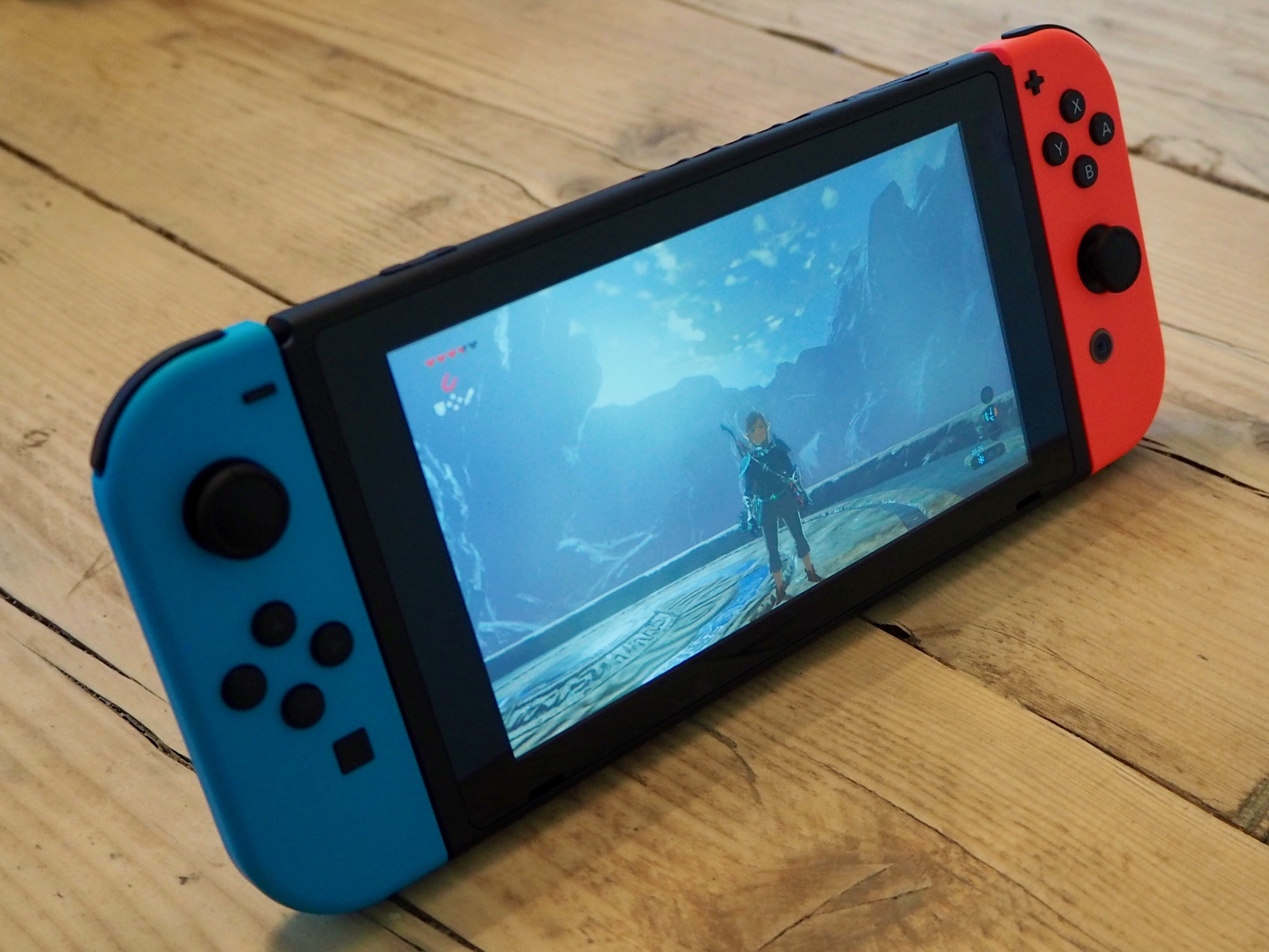
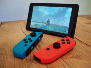
A Nintendo Switch console, showing the game The Legend of Zelda: Breath of the Wild on the screen

I originally preordered the Switch as soon as preorders were available, but ended up cancelling it shortly before the Switch’s launch. I was bitten 5 years ago by the 3DS – there were almost no games worth playing at launch, and then the system received a price cut of about 1/3rd just 4 months after it was released. Fool me once…

But then the Zelda reviews rolled in. Everyone who’d got a Switch already seemed to love the console, and Zelda was getting almost universal praise. Despite the Switch being sold out everywhere I managed to catch them in stock for a very short period at Nintendo UK, put in my order, and it arrived the next day. So how is it?

The Switch

In my opinion, the Switch is the best hardware Nintendo has produced in 10 years, since the original Wii and the DS Lite. For the most part, it’s really well built and the design is minimal and unfussy. It’s nice and compact, but the screen and controllers are just about big enough. The tablet is also reasonably light and reasonably thin (here’s a comparison to the iPad and iPhone, if you’re interested).
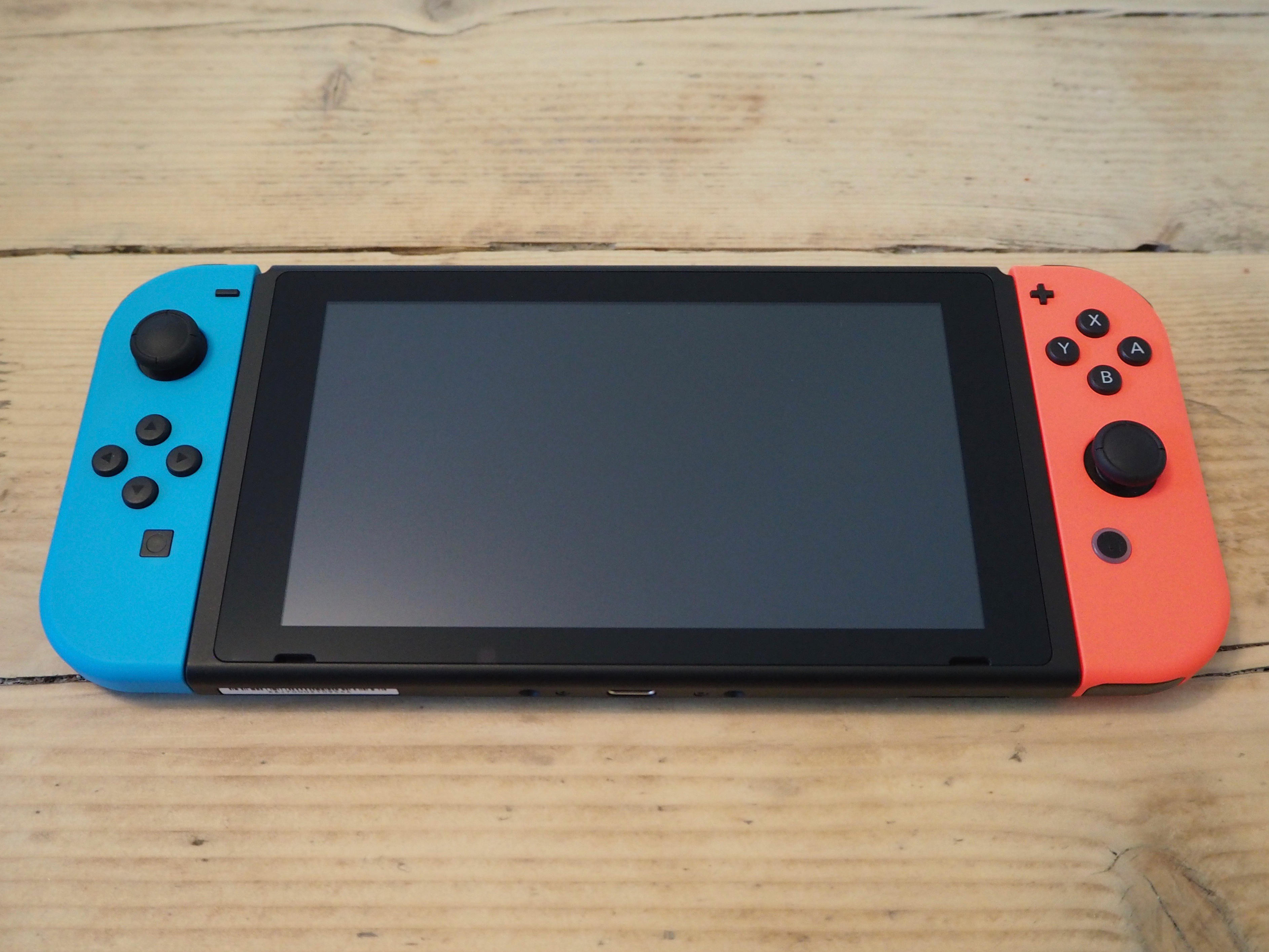
The Nintendo Switch console

The 720p screen is high quality, and in a first for Nintendo it uses capacitative touch instead of resistive touch. It feels much more modern than the 3DS and the Wii U, both of which had terribly low resolution screens with large gaps between the display and the ‘glass’. It’s the first time I’ve been really impressed with a Nintendo display in a long time (or perhaps ever?).

The system software also feels much more modern than anything Nintendo have put out before. It’s got a very nice clean UI, without any of the ‘chintz’ that I typically expect from them – pinstripes, bubbley 3D buttons and the like. It’s also nice and fast, and feels like it’s actually capable of handling several tasks at once. The 3DS and Wii’s software always felt very modal to me; you had to stop one thing to do another. It certainly feels like a version 1.0 though, and I’m excited what Nintendo add to it in the future.

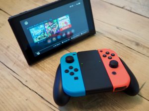
I think my favourite part of the whole system is its flexibility, which is of course the main selling point of the whole system. You can dock it and play on your big TV, or pick it up, slide in the controllers and play it handheld. Or you can prop it up, slide out the controllers and play it in ‘tabletop’ mode. Or stick the controllers into a grip and use them in a more traditional configuration. I’ve found myself switching between all the different modes and it feels great in each. It’s also really easy to switch between them.

The Joy-Con controllers feel nice in the hand, but can be a little fiddly. The shoulder buttons in particular are quite small and close together, and if you’re not using the controllers in a grip it can be hard to switch your fingers between them – there’s not quite enough to hold on to. That said, I do really like them (the neon coloured versions are amazingly bright – photos don’t do them justice), and the Switch’s flexibility means you can use them however is most comfortable to you: in a grip, held individually, attached to the Switch itself… There is also a ‘Pro’ controller available, which I haven’t tested myself but I’ve heard good things about.

I also think it’s utter genius that each console effectively comes with two controllers. When Mario Kart launches, you’ll be able to play two player local multiplayer right out of the box.

We only have one TV in our house, so I often find myself playing my PS4 via the PS4 Remote Play app on my laptop if my wife is watching TV. It works well enough, but of course a lot of visual fidelity is lost due to video compression when streaming. The Switch, then, is the perfect fit for me as it’s designed around this exact use case. The visuals are excellent when playing handheld. In fact, Zelda actually seems to perform better in handheld mode, with fewer frame rate drops but no noticeable difference in quality.

The only piece of Switch hardware that feels lesser quality to me is the TV dock, which is a bit of a disappointment. It’s a lightweight, slightly flimsy-feeling block of plastic, although I do like the glossy Switch logo on the side of it. The Joy-Con controllers are so satisfying to slide onto the Switch itself – they snap into place with a pronounced click, which is mirrored by a visual effect on the screen and a sound played by the system software.

The dock has no such satisfaction. There’s nothing to really guide the Switch into the right place and it just spongily makes contact with the bottom of the dock with a bit of a bounce. It never really feels like it’s in there properly. I wonder if Nintendo will improve this with future revisions.
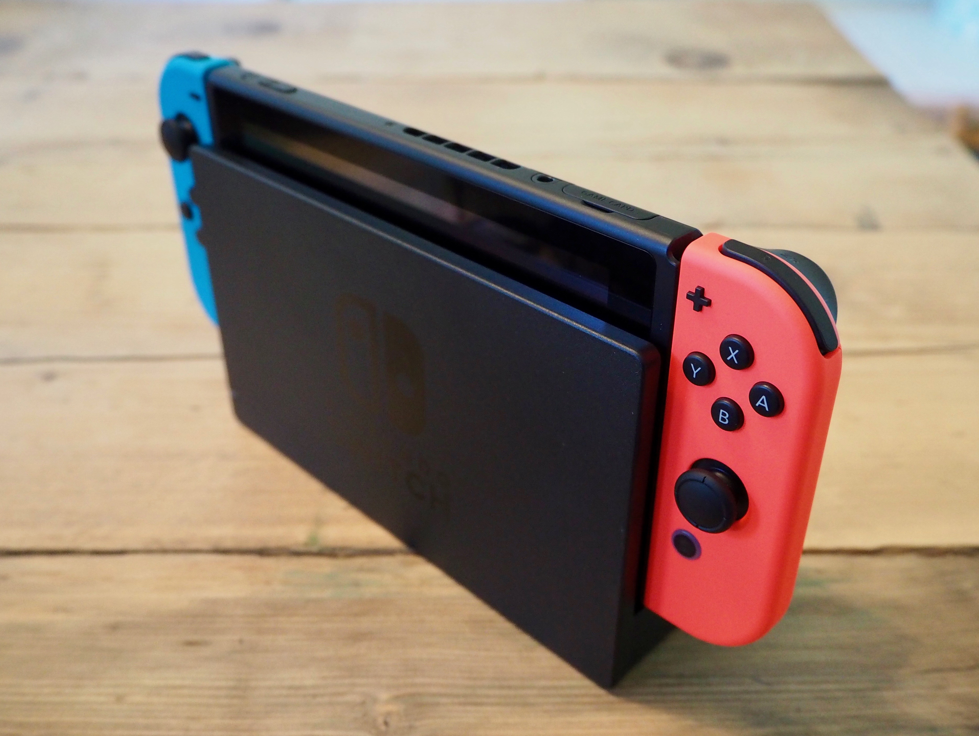
A Nintendo Switch console inserted into the TV dock accessory

Whilst reading my first draft of this post, I realized I forgot to mention the battery life of the Switch. That’s because so far it’s never been an issue for me. It’s far better than I was expecting, and I’ve never found myself running out of battery when I want to keep playing.

Pros

  • Finally, modern hardware and software from Nintendo that feels competitive with smartphones / tablets and other consoles.
  • Great feeling hardware (tablet and controllers) with excellent build quality.
  • Flexibility of play styles, which is easy to do and very well executed.
  • Battery is better than I was expecting.

Cons

  • Dock feels flimsy and is awkward to use.
  • Very few games so far. But Mario Kart, Splatoon, and Mario Odyssey are coming. Also, Zelda.

The Legend of Zelda: Breath of the Wild

Zelda is the Switch’s flagship game, and by all accounts is a real system seller. And with good reason. It’s excellent.
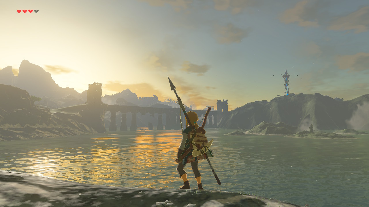
A screenshot of Breath of the Wild, with Link looking out over a sunrise above a bridge over a lake.

It feels like a Zelda game, but it’s also completely different from any other Zelda game. Pretty much from the get-go, you can go anywhere, tackle anything in any order you want, and there’s no hand-holding. The world is big. You won’t believe just how vastly hugely mindbogglingly big it is. There’s always somewhere new to explore, or some side quest to get lost in. The world also has a really interesting physics engine behind it all, which opens up all sorts of possibilities for combining different items. Shoot an arrow through a campfire into a tree and the whole thing will go up in flames. The joy is in the emergent gameplay that crops up through these interactions.

The game’s openness works really well with the Switch’s flexibility and portability. The system sleeps and wakes instantly, so you can carry this vast world around with you and drop in and out whenever you like. And if you feel like it, you can play it on the big screen too. I can see myself dipping into this world for many months (or years) to come.

I will say that whilst I am absolutely loving the game, I don’t think I agree with all of the 10/10 scores it’s been receiving. It’s definitely a 9/10 and probably even a 9.5/10, but I think it’s slightly let down by a couple of issues. It’s technically impressive what Nintendo manage to pump out of this small portable device but after just finishing Horizon: Zero Dawn on the PS4, with its lush, richly detailed landscapes Zelda feels a little lacking in places. For example I’ve come across mountain peaks with very low model and texture details: smooth domes with quite low resolution textures smeared across them and no extra set dressing. It’s perhaps a little unfair to compare the two games, but it doesn’t stand up to Zero Dawn‘s incredible world.

Objects also pop in and out of existence at a little closer distance than I’d like. You’re able to get a telescope-style zoomed view to look at the landscape around you, but it’s hard to scope things out when any enemies that may be in the distance don’t get rendered. You’ll also occasionally see super low-polygon versions of structures that are a long way off. The world is certainly beautiful, and moments regularly crop up that make me just stop in my tracks to admire the scenery. It’s just that these technical issues occasionally do crop up and break the spell:
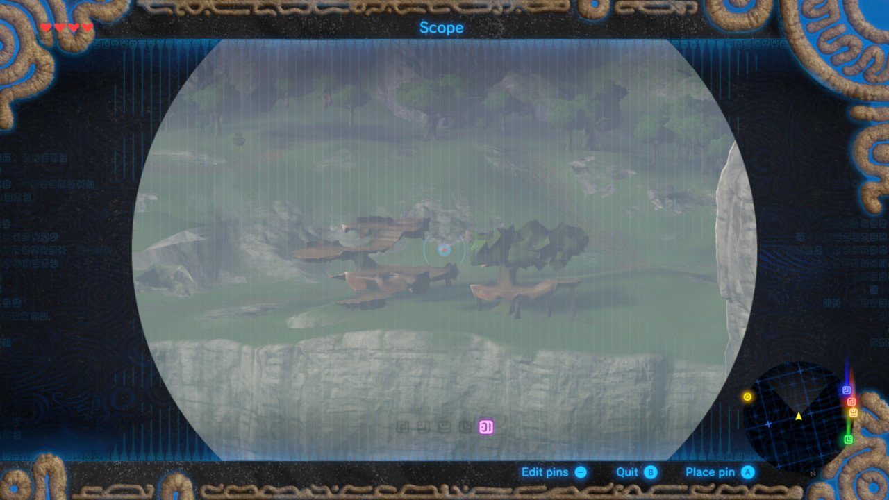
A screenshot of Breath of the Wild, showing a long distance view of a building on a mountain top. The building is very badly rendered, with an extremely low level of detail.

I’m not going to say too much more, because I think the fun in Breath of the Wild is all in discovering things for yourself. If you like Zelda games you definitely need to play it. If you haven’t played them before, you should definitely give it a go.

Pros

  • The perfect game for the Switch. Dive in and out whenever and wherever you like.
  • An incredible, vast world filled with things to see and do and play with.
  • An exciting new direction for the Zelda series.
  • Combat is fun and satisfying. There are also many, many ways to tackle different encounters with enemies thanks to the physics system.

Cons

  • Fiddly controls.
  • Technical issues do let the game down in places. It’s not too often, but sometimes breaks the immersion.
  • Voice acting is very hit and miss, and the dialogue is pretty poor.

Final thoughts

I’m really pleased with the Switch. The hardware is pretty perfect for a first revision. It’s very well built and well designed. Nintendo have finally produced hardware and software that stands up there with modern mobile devices, and it’s exciting to see where they’re going to take it. Having one device that works seamlessly from your living room to anywhere-else-you-want-to-use-it feels exciting and new, and it works exactly as it’s supposed to.

Zelda, too, feels like something new and is the perfect accompaniment to the Switch.

I really hope the Switch is as successful as Nintendo need it to be, and that they (and third parties) continue to support it with great games.