Oppo, one of the biggest phone manufacturers in China and owner of OnePlus (who make the popular 6T) recently released some phones in the UK. I needed a new Android test device so I picked up an RX17 Pro to see a different perspective – I’ve only really used stock Android before.
The hardware is actually really nice. It’s got a huge 6.4 inch screen which is almost edge to edge (slight chin), and a small notch in a nice droplet shape. It’s got a metal body and a glass back, both in this striking blue to purple fade 😍.
It has an in-display fingerprint reader – underneath the display – which seems to work well and is just very cool. It feels like proper sci-fi technology! It also has pretty good cameras – 25MP selfie camera on the front and a 20MP triple camera setup on the back.
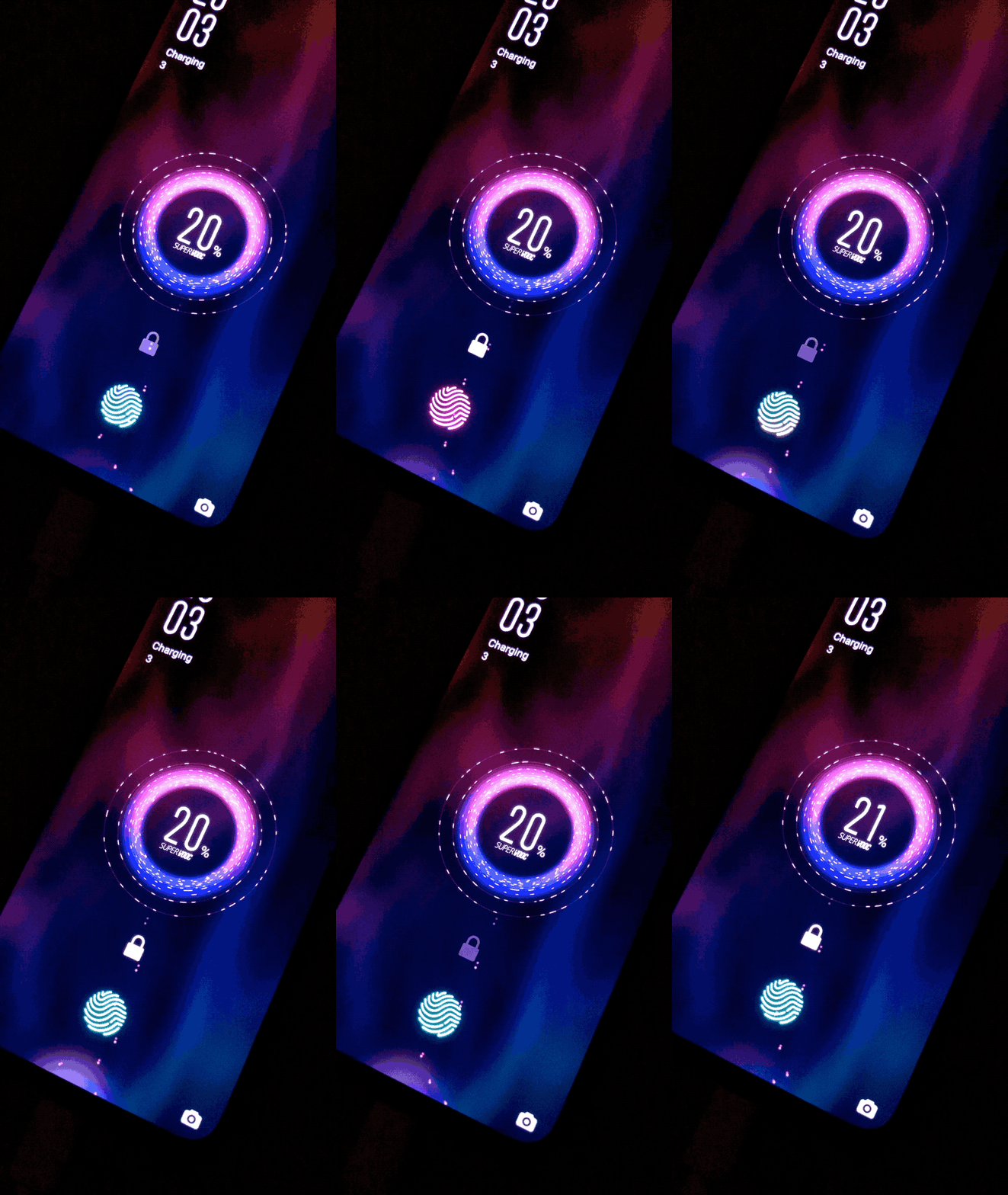
And it has incredible fast charging (seemingly the fastest available right now), albeit with the somewhat stupid name of “Super VOOC”. It charges to 40% in 10 minutes, and a full charge takes just over 35 minutes. It is bananas 🍌.
Unfortunately it all falls apart a little once you get to the software. Oppo uses their own Android fork called ColorOS, which copies a lot of design and features from iOS. A couple of examples are the sharing screen in the photos app, the system search UI, the settings app, and the camera (although everybody seems to copy iOS’s camera app).
I checked out the privacy policy during setup. Collecting browsing data about websites visited? Sending push notification adverts? Collecting occupation, postcode, and other details to form a targeted profile? I don’t know how much of this is normal but it doesn’t sound great.

Every single system app asks for permissions the first time you run it. Some of the permissions are baffling, and most of the alerts are badly written. Why do the camera and wallpaper apps need to make and manage phone calls? Why does the music app need me IMEI number? Clock?!
There’s a huge lack of attention to detail in English text throughout the OS. Worst affected seems to be lists, and anything containing a comma – these usually don’t have enough spaces around them.
All the menu options in the messages app refer to “Msgs” – even though there’s plenty of room to write “messages”. Also I don’t know if it was a bug in the software or an issue on my carrier’s end, but I apparently received 19 messages telling me my SIM was ready to use.
I mean it’s still pretty great but these rough edges are baffling and it’s a shame the software is so far behind the hardware. You can’t even argue that it’s a budget / mid-range device, as the same OS is used on Oppo’s £799 flagship, the Find X. But people will buy it, and nobody will care.
At least somebody took the time to round the corners of the system security keyboard to match the screen’s curves. Except, by default it’s never displayed at the bottom of the screen. 🙃


I leave for 5 minutes and you go Android!??? Booooo!!!
It’s all your fault Jorge!! bwhahahahahaaa!
Shiny! Congratulations on the new phone, OnePlus fan here.
What’s the other WordPress app on your first picture?